Responsive Footer
This a full responsive footer made with tailwind
This tailwind example is contributed by Pape Toulé Yade, on 16-Apr-2024. Component is made with Tailwind CSS v3. It is responsive. It supports dark mode.

Author Pape Toulé Yade
Related Examples
-
 3 years ago13k
 -
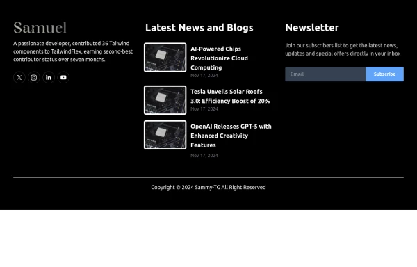
 Footer
Footer with responsive desing
1 year ago1.4k -
 3 years ago11.7k
 -
 3 years ago11.8k
 -
 1 year ago1.8k
 -
 Call to Action (for app stores)
Download app section with Playstore and Appstore button
3 years ago11.8k -
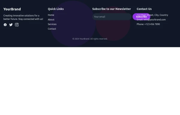 Footer
Simple Dark footer
8 months ago897 -
 canvas fully covers
canvas fully covers
10 months ago1k -
 Simple footer with CTA Button
You can use this simple footer as a base for any type of websites. It includes a single CTAs button that you can customize according to your requirement.
1 year ago2.2k -
 Premium High-Performance Web Gaming Hub
Experience the future of browser-based gaming. I’ve developed a premium arcade hub designed for speed, clarity, and zero-latency gameplay. Built with modern web technologies, Ayyamperumal Games brings AAA-inspired visuals and high-octane mechanics directly to your browser—no downloads, no lag, just pure performance. Explore a curated library of titles ranging from minimalist logic puzzles like Sudoku Elite to fast-paced action in Neon Drift. This is where clean code meets high-level entertainment.
2 months ago424 -
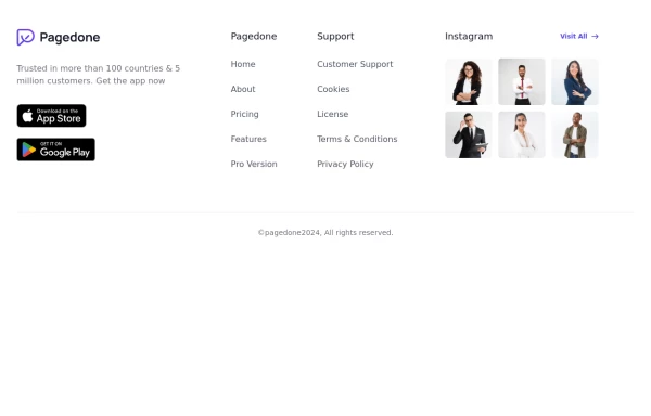 Footer with gallery
Use this example if you want to add gallery of images into your footer with brand logo, sitemap links and copyright notice.
1 year ago2.6k -
 Tailwind Footer with dark version
This example can be used if you are looking for four column footer in dark version with sitemap links, brand logo, and social media accounts.
1 year ago3.7k


Explore components by Tags
Didn't find component you were looking for?
Search from 3000+ components