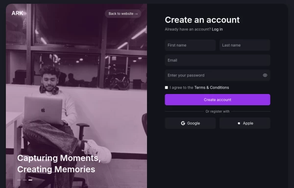
Sample login form
This tailwind example is contributed by Orestis Tsakiridis, on 28-Oct-2024. Component is made with Tailwind CSS v3. similar terms for this example are Register, Sign in

Author Orestis Tsakiridis
Related Examples
-
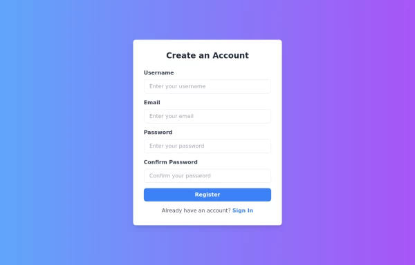 Responsive Registration Page
I created a responsive and visually appealing registration page using TailwindCSS and HTML5. This page features a gradient background, a modern card-style form, and clear input fields for username, email, password, and password confirmation. It includes client-side validation with real-time error messages to ensure all required fields are filled correctly and passwords match. This form is designed to provide a seamless user experience across all devices.
1 year ago3.2k -
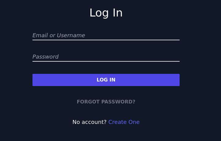
 login form
You can use this login when you want to log in to a specific website such as Facebook, Instagram, etc.
9 months ago857 -
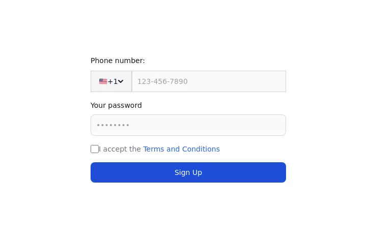 Authentication form
Use this example to authenticate users with a login form using a phone number instead of an email address.
1 year ago3.2k -
 10 months ago672
 -
 simple login
simple login
2 months ago15 -
 Your Creative Login Page
"Animated Image Login UI" "Tailwind Image Login with Animated Background" "Innovative User Login Experience" "Creative Bubble Background Login" "Login with Personality — Featuring Your Image" "Acode Master Animated Login" ✅ (customized for you)
9 months ago859 -
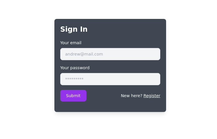 Simple Sign-In Box
It features a backdrop blur effect on a dark background, creating an elegant and modern look.
2 years ago8.1k -
 LOGIN TEMPLATE
it is a login template
8 months ago770 -
 11 months ago1.3k
 -
 Login page
Login and register page, you can reuse both
1 year ago1.9k -
 3 years ago13.4k
 -
 Registration Form
Color Updates: - Changed gradient background to `from-indigo-800 to-blue-900` - Updated text colors to `text-indigo-800` and `text-indigo-900` - Changed button colors to match the new theme - Updated focus rings to use indigo colors Enhanced Styling: - Added smooth transitions with `transition-all duration-300` - Improved shadow with `shadow-2xl` - Added hover scale effect on button - Increased border radius to `rounded-xl` - Added fade-in animation for the form Improved Validation: - Added visual feedback for invalid fields - Added input event listeners to clear error states - Added trim() to username and email validation - Added form reset after successful submission Accessibility Improvements: - Maintained proper contrast ratios - Kept focus states visible - Added proper spacing for better readability - Ensured all interactive elements are properly styled Added Interactions: - Smooth hover transitions - Scale animation on button hover - Immediate feedback on input - Clear error messaging
1 year ago2.8k


Explore components by Tags
Didn't find component you were looking for?
Search from 3000+ components