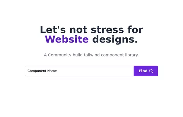
Hero Section
Created a good and responsive web Hero Page
This tailwind example is contributed by Ravi.Kumar Kumar, on 12-Feb-2025. Component is made with Tailwind CSS v3. It is responsive. It supports dark mode.

Author Ravi.Kumar Kumar
Related Examples
-
 test
testtest
7 months ago611 -
 3 years ago11.8k
 -
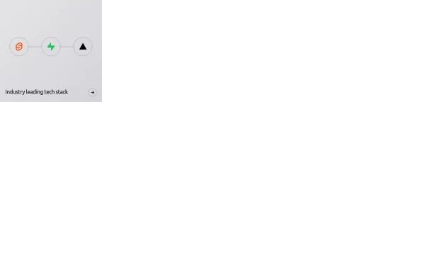 Animated bento box.
A Coastal UI component (coastalui.com). This can be used as part of a bento box, great for showing connectivity between context, could be used beyond just showing tech stacks.
10 months ago1.4k -
 Perspective 3D
Perspective 3D
2 months ago180 -
 plasma 2
plasma 2
1 month ago214 -
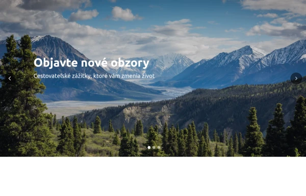 Hero Slider with Alpine.js
This responsive hero slider features full-screen image backgrounds with elegant text overlays and smooth transitions.
8 months ago2k -
 3 years ago9.5k
 -
 10 months ago2.1k
 -
 1 year ago5.8k
 -
 2 years ago10k
 -
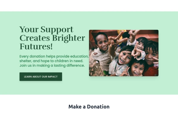 Donate Hero section
Best New tailwindcss,help save the children
8 months ago700 -
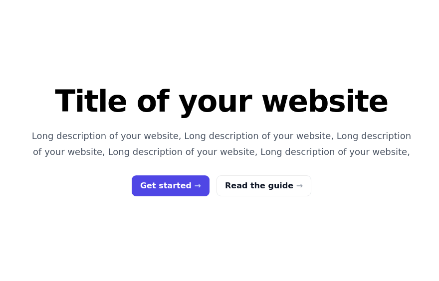
 Hero (with dark mode)
Full-width hero section with background image overlay. Includes headline, description text and CTA buttons. Supports dark mode and responsive design.
1 year ago1.4k


Explore components by Tags
Didn't find component you were looking for?
Search from 3000+ components