Clean hero section
This tailwind example is contributed by OmKar Mehta, on 04-Apr-2024. Component is made with Tailwind CSS v3. It is responsive. It supports dark mode.

Author OmKar Mehta
Related Examples
-
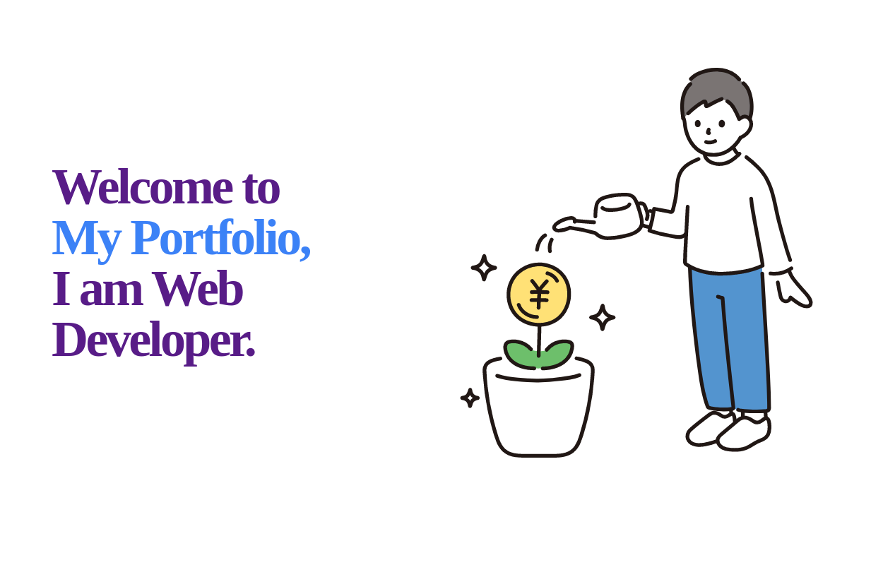 Welcome banner for developers portfolio
A hero section welcoming visitors to a portfolio or website. It features a large, visually appealing title and an image.
2 years ago10.8k -
 Responsive Hero Section with Typewriter Effect
A modern hero section featuring a typewriter animation effect, social media links, and responsive design. Includes a user avatar placeholder and a clean dark gradient background. Built with Tailwind CSS and Font Awesome icons. Perfect for personal portfolio websites.
11 months ago668 -
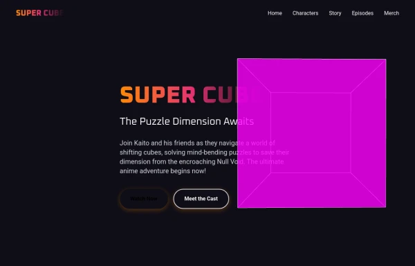 super cube
complex landing page for super cube created by salvator
9 months ago1k -
 Tool Box
by salvator
9 months ago1.2k -
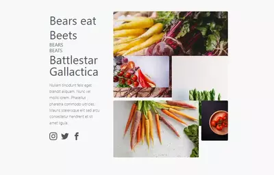 bears/beats/battlestar gallactica
bears beats battlestar gallactica
2 years ago9.7k -
 Flour mill website landing page template
flour mill and services template website which comprise of many sections like about us, featured products, why us, visit us
1 year ago15k -
 Scooby’s Hello – A Tailwind CSS Cartoon Animation
A playful animation built with Tailwind CSS and minimal custom CSS, featuring a cartoon-style Scooby-inspired dog sliding in from the left, wagging its tail, and cheerfully saying "Hello!"—perfect for adding personality to a fun web project.
9 months ago709 -
 Hero Section>> visually striking and incorporates some different elements.
Key features of this alternative hero section: 1. Background: - Uses a gradient overlay on top of a background image for depth. - Incorporates a semi-transparent dark overlay for better text contrast. 2. Layout: - Maintains a two-column layout on larger screens, stacking on mobile. - Left side focuses on a bold, three-line tagline and concise description. - Right side features a glassmorphic card with key selling points. 3. Design Elements: - Uses a custom Google Font (Poppins) for a modern look. - Incorporates rounded buttons with hover effects. - Features colorful icons for the selling points. - Adds a decorative wave SVG at the bottom for visual interest. 4. Responsiveness: - Adjusts padding, font sizes, and layout for different screen sizes. - Stacks buttons vertically on very small screens. 5. Interactivity: - Includes hover effects on buttons and links. This design aims to create a more visually impactful first impression while still maintaining clarity and focus on the key messages and call-to-action elements. The use of a background image with overlays adds depth, while the glassmorphic card on the right adds a modern touch. You can further customize this by: - Changing the background image URL to one that fits your brand. - Adjusting colors in the gradient, buttons, and icons to match your brand colors. - Modifying the tagline, description, and selling points to fit your company's message. Would you like me to explain any part of this code or make any further adjustments?
1 year ago5.3k -
 Cyamunara
used to sell everything someone need to sell
9 months ago926 -
 Fully Animated Timeline Card
It is at a 20s interval for testing purposes. Go to the <style> and change the .content-scroll class from 20s to 35s for a production ready slower animation.
1 year ago2k -
 2 years ago6.6k
 -
 1 month ago105


Explore components by Tags
Didn't find component you were looking for?
Search from 3000+ components