Perspective 3D
Perspective 3D
This tailwind example is contributed by Omer fils ELENGA, on 27-Nov-2025. Component is made with Tailwind v3.4. It is responsive.

Related Examples
-
 Smooth Slide-in Animation for Text in Tailwind CSS
Learn how to create a smooth slide-in animation for text using Tailwind CSS. This guide covers defining custom animations in tailwind.config.js and applying them to elements for a modern and engaging UI effect. 🚀
2.8k -
 7.7k
-

-
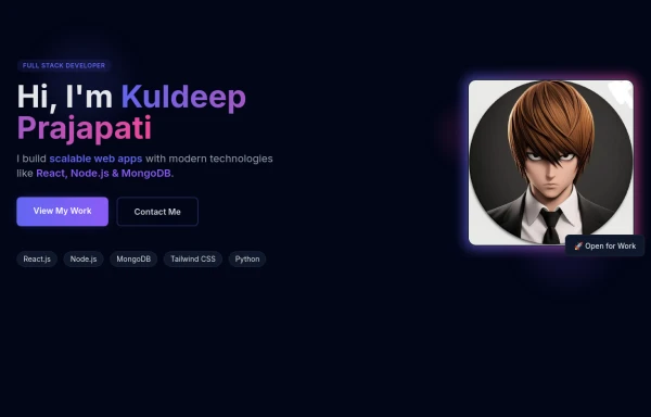
 beautifull portfolio page
I create a portfolio page
3.2k -
 Modern SaaS Agency Landing Page with Dark Mode & Mobile MenuE-Com With nav and filter
A premium SaaS agency landing page built with HTML, Tailwind CSS, and JavaScript. It features a sticky glassmorphism navbar, responsive mobile navigation drawer, light/dark mode toggle, animated hero section, case studies, services, process timeline, testimonial, FAQ accordion, booking CTA, and a clean modern footer. Perfect for startups, AI products, software agencies, creative studios, and digital businesses.
518 -

-
 Gaming UI Card, Form
A modern, senior-level gaming UI built with Tailwind CSS focusing on spacing, typography, and calm visual hierarchy rather than noisy effects. This component set includes: A premium gaming card with clear content structure and outcome-focused copy A clean player signup form with accessible focus states and minimal visual noise A custom animated button using a restrained light-sweep effect for premium interaction feedback Designed to resemble real production gaming platforms rather than demo or template UI. Fully responsive, copy-paste ready, and easy to extend for real-world projects.
732 -

-
-
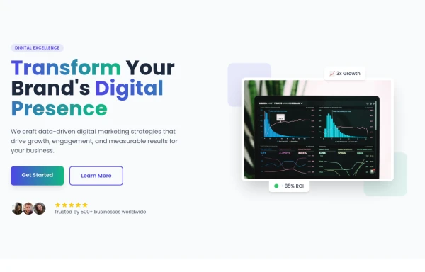 Hero Section
Modern Gradient Color Scheme - Uses a professional purple-to-teal gradient for visual appeal Animated Elements: Floating decorative circles with subtle animation Fade-in effect for the main illustration Pulsing status indicator Engaging Typography: Gradient text for key phrases Responsive font sizing Clean Poppins font family Social Proof Elements: Client avatars Star ratings Trust indicators ("Trusted by 500+ businesses") Call-to-Action Buttons: Primary gradient button Secondary outlined button Hover effects and transitions Visual Hierarchy: Clear headline with emphasis on transformation Supporting subheading Balanced layout with image Performance Indicators: ROI badge Growth metric badge Responsive Design: Works on mobile and desktop Grid layout that adapts to screen size
1.4k -
-
 FUTURIC.
634


Browse by topic
Explore components by Tags
Jump straight to the UI pattern you need.
Can't find it?
Didn't find the component you were looking for?
Search across 3,000+ community-built components and grab the code in seconds.