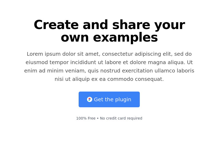
Hero
This tailwind example is contributed by ABDO-SY, on 04-Mar-2025. Component is made with Tailwind CSS v3.

Author ABDO-SY
Related Examples
-
 Linear dinamique section by Raul antonio de la cruz hernandez remix omerlinx responsive
Linear dinamique section by Raul antonio de la cruz hernandez remix omerlinx responsive
2 months ago126 -
 3 years ago10k
 -
 3 years ago12.2k
 -
 composent clean
composent clean
3 months ago197 -
 Stars: Sun and Moon Illustrations
I Created Sun and Moon Illustrations with Tailwind CSS, Embracing Light and Dark Modes
1 year ago4.3k -
 Trading
used to trade something
9 months ago786 -
 3 years ago12.9k
 -
 Hero Section
Full width hero section for landing pages
3 years ago13.9k -
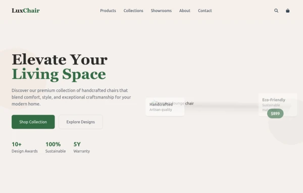 chair
chairby salvator
9 months ago1k -
 Real Estate Website • Hero Section
polished, professional Hero section
4 months ago502 -
 flower
by salvator
9 months ago1.3k -
 DailyDev Card
Card -based card used in the Dailydev Card, this is created to be modified to taste of each user
1 year ago1.8k


Explore components by Tags
Didn't find component you were looking for?
Search from 3000+ components