Hero with video background
This tailwind example is contributed by farisubuntu, on 02-Oct-2024. Component is made with Tailwind v3.4. It is responsive.

Related Examples
-
 hero template
hero section
-
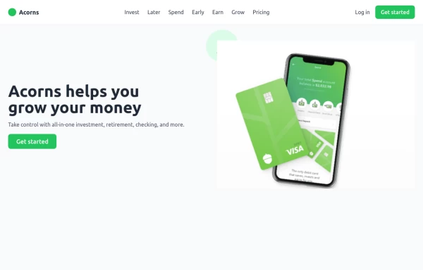 Digital banking hero
Create a professional and trustworthy hero section for a banking landing page using TailwindCSS. This section features a bold, confidence-inspiring headline, a clear subheading emphasizing security and ease of banking, and a call-to-action button for account sign-ups or exploring services. With a modern, clean design, a background that reflects stability and innovation, and visually appealing elements, this hero section establishes credibility and trust. Ideal for online banking, fintech startups, and financial institutions, ensuring a seamless and engaging user experience.
2.4k -
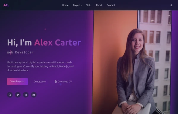 modern portifolio
by salvator
1.2k -
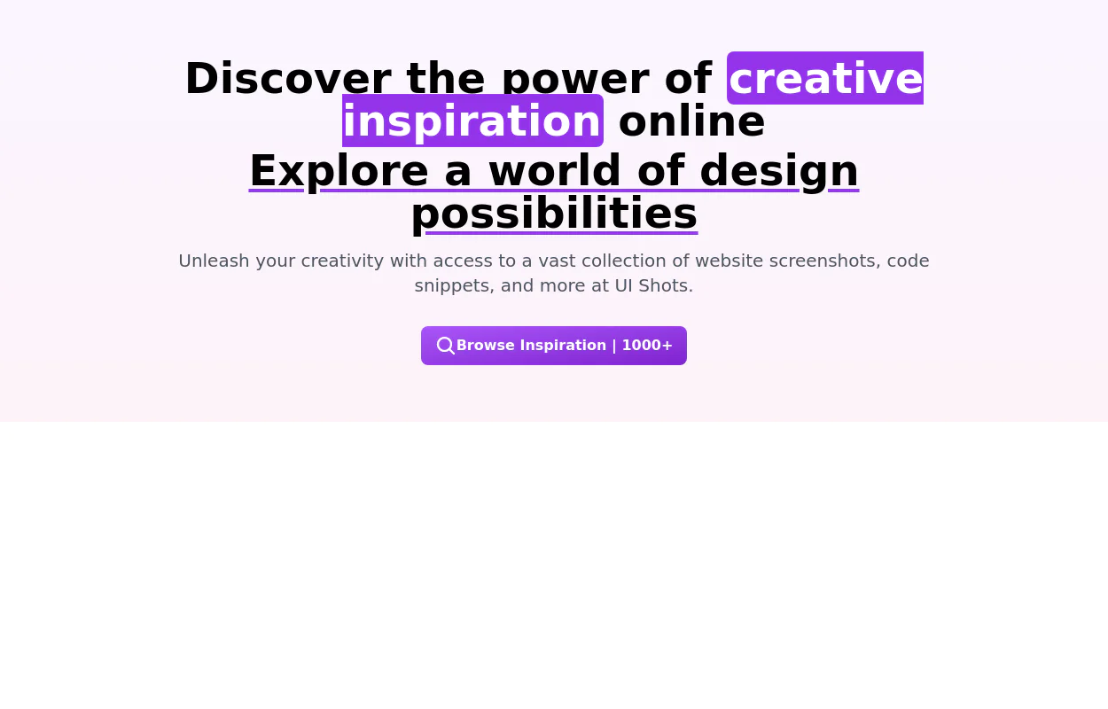 A hero component
It has a gradient background, a large title with a creative emphasis, and a call-to-action button.
10k -
-
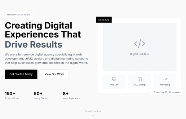
-
 FLESH & BONE
Stranded in the heart of a cannibal-infested jungle, you must make unthinkable choices to survive. How far will you go to see another sunrise?
1.2k -

-
-
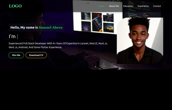 Portfolio Hero Section 2
visually stunning and captivating hero section component for your portfolio website.
6.3k -
 Tailwind Hero Section
Fully Responsive Hero Section with Navbar
5.4k -
 Responsive Hero Section
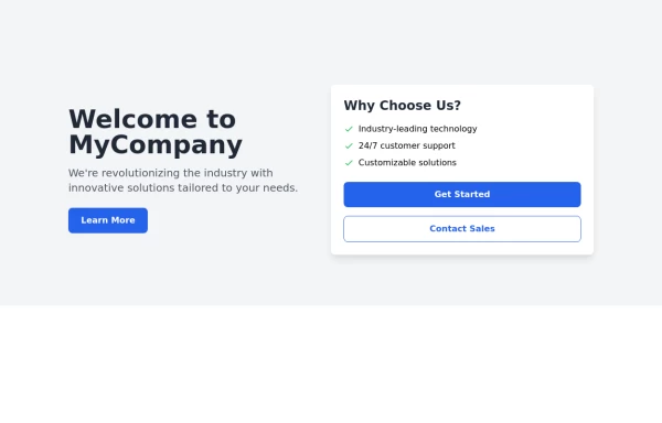
Key features of this hero section: 1. Responsive layout: Uses a column layout on mobile and switches to a row layout on medium screens and larger. 2. Left side: - Company name as a large heading - Brief description - "Learn More" button 3. Right side: - "Why Choose Us?" section with bullet points - Two call-to-action buttons: "Get Started" and "Contact Sales" 4. Styling: - Uses Tailwind's utility classes for responsive design, colors, spacing, and typography - Incorporates a shadow and rounded corners for the right-side content box - Includes hover effects on buttons for better interactivity This hero section will be fully responsive: - On mobile devices, it will stack vertically with the company info on top and the details below. - On larger screens, it will display in a two-column layout. The use of Tailwind CSS classes ensures that the design is consistent and easily adjustable. You can further customize the colors, fonts, and spacing to match your brand's specific design guidelines. Would you like me to explain any part of this code or make any adjustments?
2.6k











Browse by topic
Explore components by Tags
Jump straight to the UI pattern you need.
Can't find it?
Didn't find the component you were looking for?
Search across 3,000+ community-built components and grab the code in seconds.