Trading
used to trade something
This tailwind example is contributed by nii fanny, on 25-May-2025. Component is made with Tailwind CSS v3. It is responsive.

Author nii fanny
Related Examples
-
 2 years ago4.2k
 -
 1 year ago2.4k
 -
 2 years ago7.2k
 -
 login form php
A login form is a user interface element commonly found on websites and applications. Its main purpose is to authenticate users by asking them to entecredentian
9 months ago1k -
 Hero section - Htmlwind
Simple centered hero section
9 months ago1.1k -
 Hero_Page
#heropage #landingpage
8 months ago709 -
 Responsive Hero Section
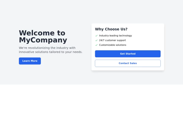
Key features of this hero section: 1. Responsive layout: Uses a column layout on mobile and switches to a row layout on medium screens and larger. 2. Left side: - Company name as a large heading - Brief description - "Learn More" button 3. Right side: - "Why Choose Us?" section with bullet points - Two call-to-action buttons: "Get Started" and "Contact Sales" 4. Styling: - Uses Tailwind's utility classes for responsive design, colors, spacing, and typography - Incorporates a shadow and rounded corners for the right-side content box - Includes hover effects on buttons for better interactivity This hero section will be fully responsive: - On mobile devices, it will stack vertically with the company info on top and the details below. - On larger screens, it will display in a two-column layout. The use of Tailwind CSS classes ensures that the design is consistent and easily adjustable. You can further customize the colors, fonts, and spacing to match your brand's specific design guidelines. Would you like me to explain any part of this code or make any adjustments?
1 year ago2.8k -
 L'art de coder
L'art de coderL'art de coder
2 weeks ago10 -
 11 months ago1.1k
 -
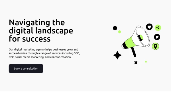
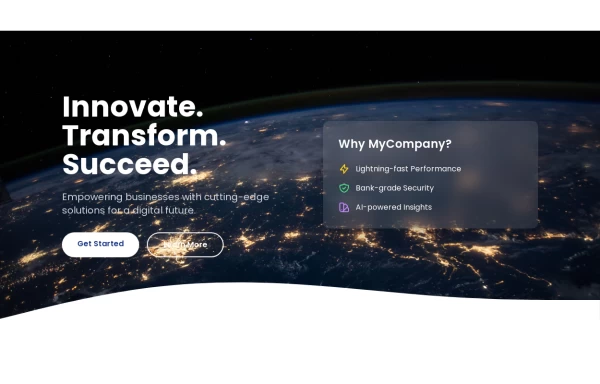 Hero Section>> visually striking and incorporates some different elements.
Key features of this alternative hero section: 1. Background: - Uses a gradient overlay on top of a background image for depth. - Incorporates a semi-transparent dark overlay for better text contrast. 2. Layout: - Maintains a two-column layout on larger screens, stacking on mobile. - Left side focuses on a bold, three-line tagline and concise description. - Right side features a glassmorphic card with key selling points. 3. Design Elements: - Uses a custom Google Font (Poppins) for a modern look. - Incorporates rounded buttons with hover effects. - Features colorful icons for the selling points. - Adds a decorative wave SVG at the bottom for visual interest. 4. Responsiveness: - Adjusts padding, font sizes, and layout for different screen sizes. - Stacks buttons vertically on very small screens. 5. Interactivity: - Includes hover effects on buttons and links. This design aims to create a more visually impactful first impression while still maintaining clarity and focus on the key messages and call-to-action elements. The use of a background image with overlays adds depth, while the glassmorphic card on the right adds a modern touch. You can further customize this by: - Changing the background image URL to one that fits your brand. - Adjusting colors in the gradient, buttons, and icons to match your brand colors. - Modifying the tagline, description, and selling points to fit your company's message. Would you like me to explain any part of this code or make any further adjustments?
1 year ago5.4k -
 walve style by omerlink
walve style by omerlink
1 month ago132 -
 Tailwind Pricing Section
Fully Responsive Pricing Section
1 year ago2k


Explore components by Tags
Didn't find component you were looking for?
Search from 3000+ components