login form php
A login form is a user interface element commonly found on websites and applications. Its main purpose is to authenticate users by asking them to entecredentian
This tailwind example is contributed by nii fanny, on 28-May-2025. Component is made with Tailwind CSS v3. It is responsive.

Author nii fanny
Related Examples
-
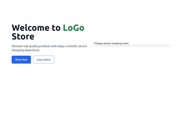
 e-commerce website landing page template with Tailwind CSS.
A clean, responsive e-commerce & blog template built with Tailwind CSS. Features light/dark mode, dynamic featured posts, hero, CTA, and SEO-ready sections.
2 months ago538 -
 1 year ago1.6k
 -
 Tailwind flex Hero
Show Image with flex image gallery
1 month ago208 -
 Zoo management
this a navigation bar and hero section of a zoo management system
9 months ago1.1k -
 tinderclone By omerlinks
tinderclone By omerlinks
2 months ago71 -
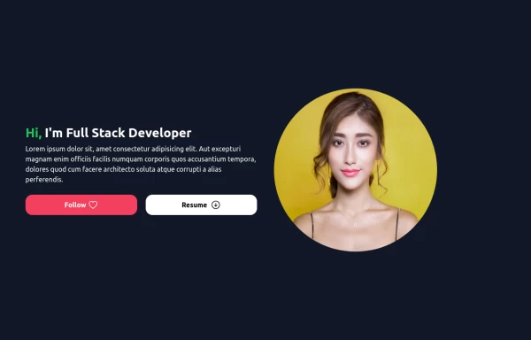
 Hero $ Navigation
This is a modern, AI-focused landing page for a company called NEURALCORE that offers enterprise-grade AI solutions.
9 months ago1.1k -
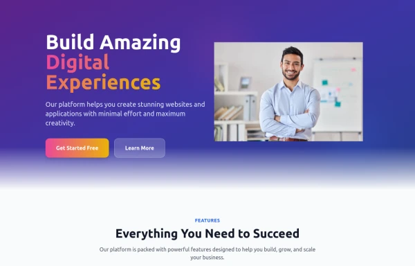 home page
Hero Section: Gradient background with noise texture Animated floating image Gradient text effect Call-to-action buttons Features Section: Three feature cards with gradient headers Hover animations Clean iconography Stats Display: Full-width gradient background Clean stat presentation Testimonials: Three testimonial cards with user avatars Star ratings Border accents Hover scaling effects Call-to-Action (CTA) Section: Gradient background Centered content Multiple action buttons Footer: Four-column layout Social media icons Newsletter signup Copyright information Design Features: Vibrant gradient color scheme Smooth hover animations and transitions Responsive layout for all screen sizes Modern typography Subtle floating animations Clean, card-based design
9 months ago1.1k -
 Flour mill website landing page template
flour mill and services template website which comprise of many sections like about us, featured products, why us, visit us
1 year ago15.1k -
 MENU OMERLINKS
MENU OMERLINKS
1 month ago145 -
 2 years ago9.3k
 -
 2 months ago157
 -
 Hero Section with Dark Mode
Hero Section template using Tailwind CSS. It adapts to light and dark modes using the dark: variant and still fits seamlessly under your fixed navbar.
9 months ago900


Explore components by Tags
Didn't find component you were looking for?
Search from 3000+ components