File Input
File Input
This tailwind example is contributed by Aman kumar, on 28-Jun-2024. Component is made with Tailwind CSS v3. It is responsive.

Author Aman kumar
Related Examples
-
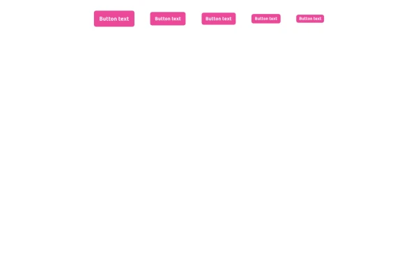
Button
Button When Hover and page Reload then Button text will show the animation
1 year ago2.7k -
 Buttons - Htmlwind
Primary buttons
9 months ago604 -
Glowing gradient button
Button on black background
3 years ago39.4k -
 Previous Next Buttons
Pagination buttons
3 years ago14.4k -
3 years ago16.2k
-
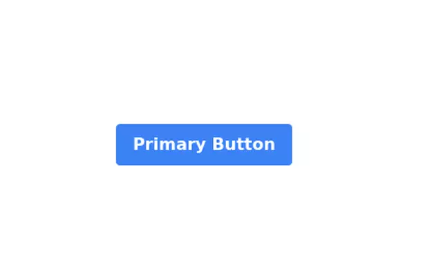 Primary Button
Elegant button
3 years ago11.9k -
 Button
Material Button
1 year ago2.4k -
 3 years ago13.4k
 -
 1 year ago2.9k
 -
3 years ago12.6k
-
 11 months ago2.3k
 -
Gradient Button
These buttons use a style that includes two contrasted colors creating an impressive mesh gradient effect.
1 year ago4.4k


Explore components by Tags
Didn't find component you were looking for?
Search from 3000+ components