Responsive Classes List Table with Edit and Delete buttons using Tailwind CSS
This responsive classes list table is built using Tailwind CSS and features:
- A clean layout with a header displaying column titles.
- Action buttons for editing and deleting entries.
- Responsive design that adapts to various screen sizes.
- Easy customization options to fit your project's needs.
This tailwind example is contributed by Anum Shahana, on 13-Oct-2024. Component is made with Tailwind CSS v3. It is responsive. similar terms for this example is HR

Author Anum Shahana
Related Examples
-
 Previous Next Buttons
Pagination buttons
3 years ago14.3k -
 Multi-Step Form Wizard
Working Multi-Step Form more complex forms. made with tailwind CSS v3 and javascript
1 year ago6.9k -
 2 years ago12.3k
 -
1 year ago1.9k
-
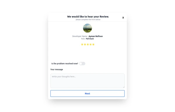 Review popup form with toggle and stars
Review popup form with toggle and stars
9 months ago806 -
 1 year ago3.1k
 -
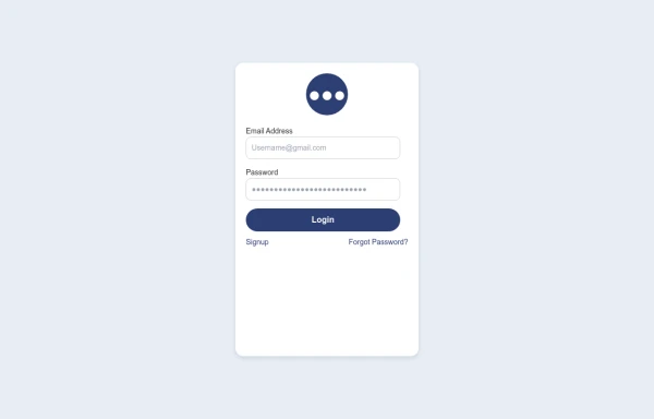 login
loginlogin by : html , css
9 months ago1.5k -
 Card
CardCard with Likes and download Button
2 years ago10.7k -
 Premium Button Collection with 12 Unique Animations
Collection de 12 boutons premium avec animations uniques : glow, shine, slide, 3D push, neon pulse, glassmorphism, gradient border et plus. Chaque bouton a son propre effet hover. 100% Tailwind CSS, no JavaScript.
2 months ago298 -
 Responsive Contact Section Using Tailwind CSS
This HTML and Tailwind CSS snippet creates a visually appealing and responsive contact section. Designed to adapt seamlessly across different screen sizes, this component features two main areas: the contact information block and a contact form. The contact block displays essential details like phone, email, and address, alongside social media links, all encapsulated within a cyan-themed card with rounded corners and shadow effects for depth. The form area, highlighted with a contrasting white background, ensures a user-friendly interface for submitting contact details. This code snippet is perfect for integration into any modern web application requiring a responsive and stylish contact section.
1 year ago2.9k -
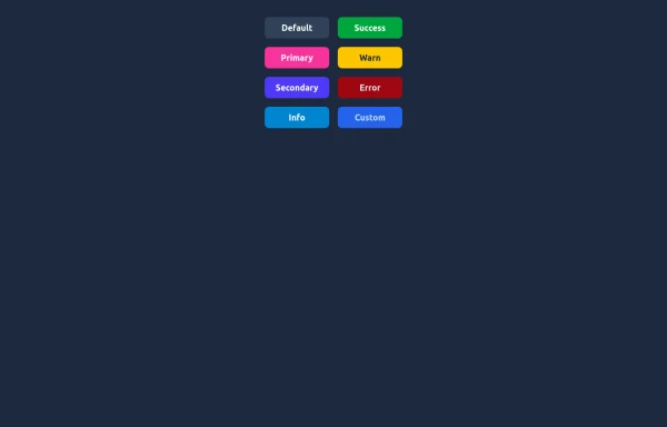 Elegant Buttons
Useful Tailwind classes for creating several types of basic buttons.
9 months ago735 -
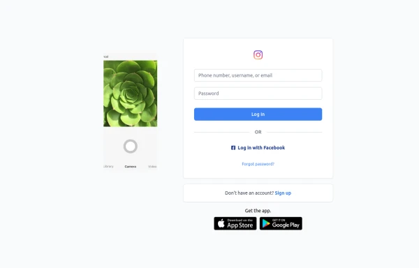 Best Log In page ever
Instagram look like but not copy right 🤗,best login and sign and even for many others
8 months ago847


Explore components by Tags
Didn't find component you were looking for?
Search from 3000+ components