button
This tailwind example is contributed by Lokesh H, on 12-Aug-2026. Component is made with Tailwind v3.4. It is responsive.

Related Examples
-
Button
Material Button
2.1k -
 SCROLL ABAJO
para poner que a llegado al final de la pagina
-
 12.5k
12.5k -
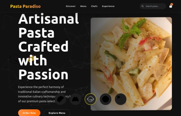 pasta
pastaby salvator
1.3k -
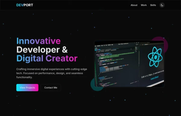 DevPort
modern portifolio by salvator
1.6k -
 hero modern
hero modern
839 -

-
-
Button wih hover gradient
Works well with the dark theme
18.8k -
 Social buttons
Mono-color Social buttons change colors according to your need
12.4k -
Plug and Play Animated Button for Hero Statements / Landing Pages
REMOVE the bg-black from the outside <button/> div, if you are already using a black background. Besides this, the button is plug and play! Know errors: You may need to remove animate-spin for your usecase, depending on framework rendering. For SvelteKit, animate-spin is NOT needed. But the [animation:spin_4s]... is always necessary for a smooth effect. Check out my profile to join my community online or add me on LinkedIn.
2.6k






Browse by topic
Explore components by Tags
Jump straight to the UI pattern you need.
Can't find it?
Didn't find the component you were looking for?
Search across 3,000+ community-built components and grab the code in seconds.