Pricing section
This tailwind example is contributed by Leon Bachmann, on 19-Dec-2022. Component is made with Tailwind v3.4. It is responsive. similar terms for this example are Service rates, Subscription plans

Related Examples
-

-

-
 634
634 -
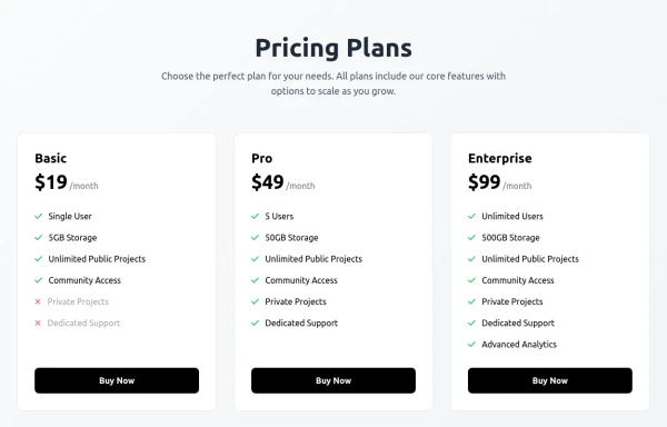
 Pricing Plans
This plan offers access to all basic features, including unlimited projects and 24/7 support
1.1k -
 11.7k
11.7k -
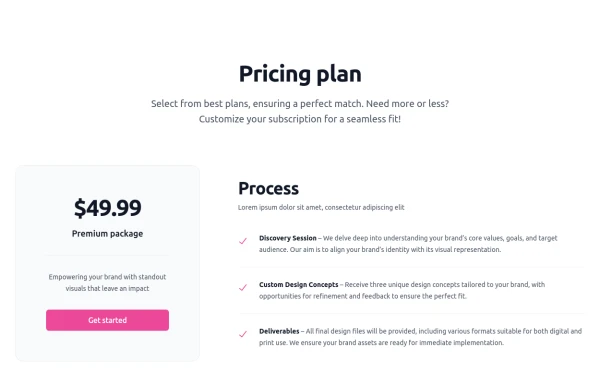 Pricing section - Htmlwind
Single pricing
1.3k -

-
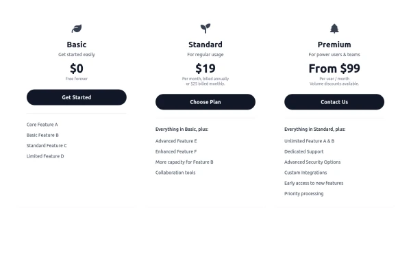 Responsive 3-Tier Pricing Card Section
A clean and responsive pricing table component featuring three distinct tiers (e.g., Basic, Standard, Premium) presented in a card layout. Built with HTML and Tailwind CSS, it stacks vertically on small screens and transitions to a side-by-side view on medium screens (md breakpoint - 768px) and up. Each plan card includes a placeholder icon, title, description, price details, a call-to-action button, and a bulleted list of features with checkmarks. The generic content makes it easy to adapt for various websites or applications needing a clear pricing comparison structure.
982 -
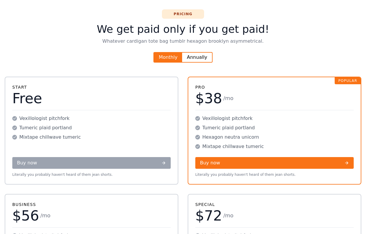 Responsive pricing cards with heading
grid of 4 pricing cards with a Switch button for Monthly Annually plans and heading
14.4k -

-
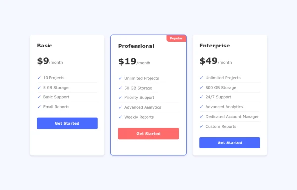 Interactive Pricing Cards
this are pricing cards
1.7k -
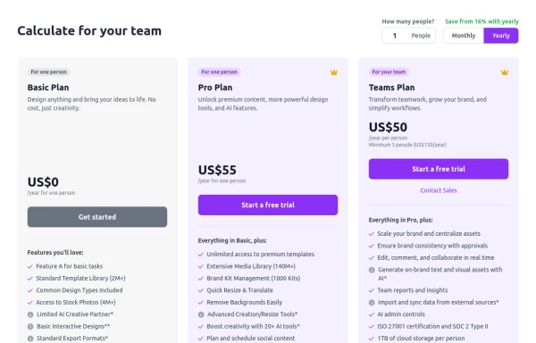 Configurable 3-Tier Responsive Pricing Table
A modern, responsive pricing table component inspired by SaaS layouts, built with HTML and Tailwind CSS. Features three distinct pricing tiers displayed in cards, stacking vertically on smaller screens and transitioning to a 3-column grid on large screens (lg breakpoint). Includes interactive top controls for selecting the number of users and toggling between monthly/yearly billing cycles. Each card uses placeholder content for icons, titles, descriptions, features (with checkmarks/info icons), and distinct call-to-action buttons, making it easily adaptable. Styled with subtle background colors and clear typography for excellent readability.
1.6k









Browse by topic
Explore components by Tags
Jump straight to the UI pattern you need.
Can't find it?
Didn't find the component you were looking for?
Search across 3,000+ community-built components and grab the code in seconds.