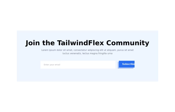
Newsletter form
This tailwind example is contributed by Leon Bachmann, on 24-Jan-2023. Component is made with Tailwind v3.4. similar terms for this example is Email campaign

Related Examples
-
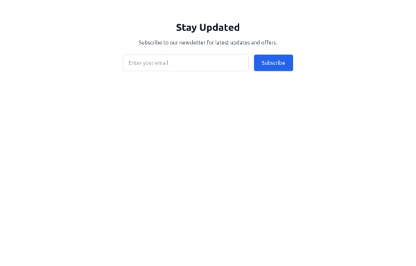 newsletter
Subscribe to our newsletter for latest updates and offers.
1.7k -
 Newsletter
This template ensures your newsletter stands out with smooth animations, professional design, and a responsive layout.
1.2k -

-
-

-
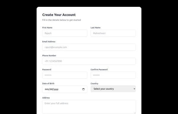 Responsive Form
This modern, fully responsive account creation form is designed using HTML and Tailwind CSS, ensuring a clean, professional, and accessible user experience. It features a card-based layout with smooth spacing, a subtle shadow effect, and a structured grid system for optimal responsiveness across all devices.
1.8k -
-
 The Free AI Tools Grid Section (210+ Tools, No Signup)
A responsive and SEO-optimized grid section showcasing over 210 free AI tools. Designed with Tailwind CSS, fully responsive, fast-loading, and built for high user engagement. No sign-up required, privacy-friendly, and optimized for performance and discoverability.https://www.thefreeaitools.com/
-
 AI Trends Showcase
A clean and modern intelligence feed component for showcasing AI, technology, startup, and research updates with automatic rotation, smooth navigation, and responsive layouts. Perfect For Showcase AI, technology, and innovation stories using a premium editorial-style carousel. Designed with a clean dark aesthetic, automatic slide rotation, interactive breadcrumbs, navigation controls, and a responsive layout that works seamlessly across desktop and mobile devices.
332 -
 Newsletter Section
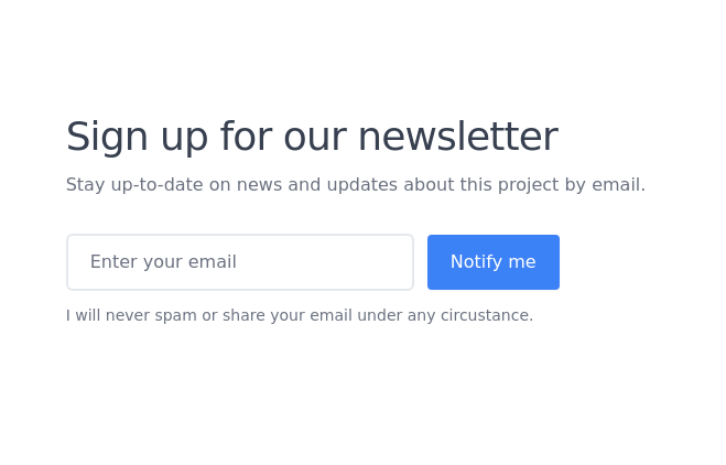
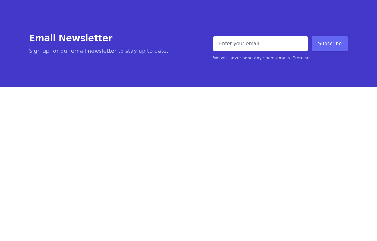
On your website or application, add a beautiful and responsive Newsletter Subscription Form. These Tailwind CSS Newsletter Forms are easy to use and customizable, allowing you to create a wide range of newsletter form styles that suit your website's design.
-
 Modern Editorial News & Events Section
Overview: A sophisticated, responsive layout designed to highlight a primary featured story alongside a vertical list of recent updates or upcoming activities. It features a clean "magazine-style" aesthetic, utilizing serif typography for headings to create an elegant, high-end feel suitable for professional services or educational institutions. Key Features: Split Grid Layout: Uses a 12-column grid system (lg:col-span-7 vs lg:col-span-5) to balance the large featured content with the side list. Featured Card (Left): Image Zoom: subtle scale-105 transformation on the main image when hovering over the container. Backdrop Badge: A frosted glass effect category badge over the image. Interactive List (Right): Smart Date Boxes: The date indicators act as design elements that invert colors (e.g., yellow background to yellow text) on hover. Micro-interactions: List items "lift" slightly (-translate-y-1) upon interaction. Typography: Integrates Google Fonts (DM Serif Display) for headings to break the monotony of standard sans-serif fonts and add character. Tech Stack: Framework: Tailwind CSS. Icons: Ionicons (Script included). Fonts: Google Fonts (DM Serif Display + Inter). Usage: Ideal for "Latest News," "Upcoming Seminars," or "Blog Highlights" sections on a landing page. Ensure the Google Fonts link is included in the <head> for the correct visual style.
-
 Modern responsive Newsletter form
Responsive newsletter subscriber form
3.5k







Browse by topic
Explore components by Tags
Jump straight to the UI pattern you need.
Can't find it?
Didn't find the component you were looking for?
Search across 3,000+ community-built components and grab the code in seconds.