Product page
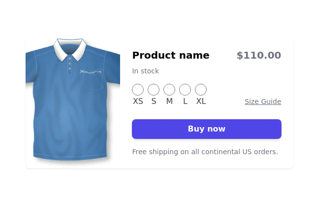
Product Information Card component that provides comprehensive details about a product, including an image, name, description, price, availability, color and size options, and a product description.
This tailwind example is contributed by Lee Josh, on 27-Apr-2024. Component is made with Tailwind CSS v3. It is responsive. It supports dark mode. similar terms for this example are Product Showcase, Product card

Author Lee Josh
Related Examples
-
 1 year ago1.7k
 -
 4 months ago232
 -
 3 years ago31.7k
 -
 4 months ago329
 -
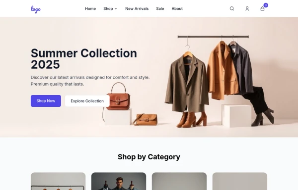
 e-commerce website landing page template with Tailwind CSS.
A clean, responsive e-commerce & blog template built with Tailwind CSS. Features light/dark mode, dynamic featured posts, hero, CTA, and SEO-ready sections.
2 months ago537 -
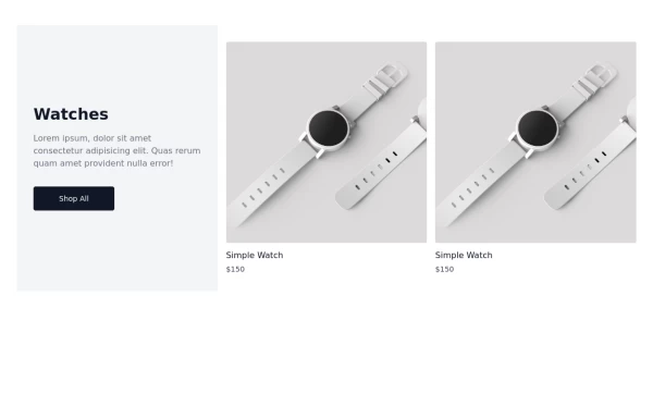 Watch Card
Watch Cards
1 year ago2.3k -
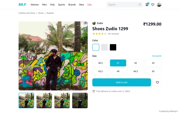 shopping cart page product
Product page design single product, connect me for jsx https://abhirajk.vercel.app/
1 year ago1.7k -
 1 year ago2.5k
 -

-
 1 year ago2k
 -
 Hello Acode Master! 👋
is a passionate software developer based in Rubavu. He considers himself the top developer in the area and is committed to solving real-world problems through technology.
9 months ago871 -
 E-commerce Website UI Design
Here is a well-structured UI Design for a general e-commerce website template. This can be used as a reference for designers and developers to build or evaluate the UI components needed for an e-commerce site. View https://github.com/Rathanak-Phan/general-e-commerce-website-template
9 months ago2k


Explore components by Tags
Didn't find component you were looking for?
Search from 3000+ components