AI Orb For Voice To Voice
This tailwind example is contributed by Hamza Atig, on 11-Mar-2026. Component is made with Tailwind v3.4. It is responsive.

Related Examples
-
 Custom Audio Player
🎧 Custom Audio Player (HTML, Tailwind CSS & Alpine.js) A modern, responsive custom audio player built with Tailwind CSS and Alpine.js, designed for a smooth user experience and elegant visuals in both light and dark mode. ✨ Features: 🎵 Play, pause, and mute/unmute controls 📈 Interactive progress bar with seek functionality 🔊 Dynamic volume slider with live preview 🖼️ Album art and track details display ⌨️ Keyboard support — toggle play/pause with the spacebar 🌓 Fully responsive and dark-mode compatible This player uses minimal JavaScript, relying on Alpine.js for reactivity, and can be easily customized or integrated into any web project. Perfect for portfolios, podcasts, or music web apps.
1.4k -
 Flex and Flex-Col
วิธีการใช้ Flex และ Flex-Col
1.2k -
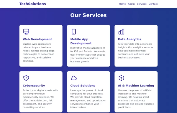 Services
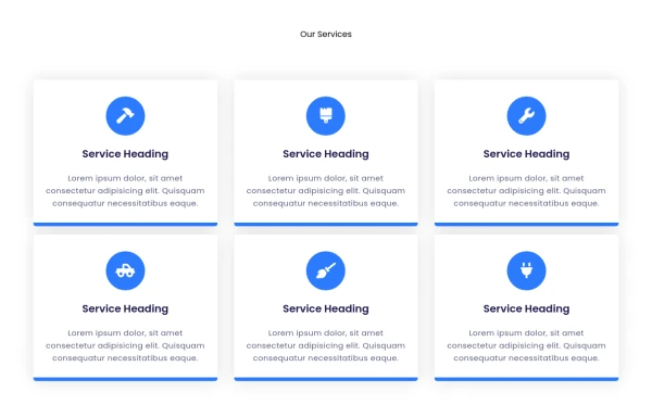
This Services page design includes: 1. Responsive layout using Tailwind CSS grid system 2. Indigo-800 and Blue-900 color scheme 3. Dark mode support 4. Header with navigation 5. Six service cards with icons, titles, and descriptions 6. Footer with copyright information 7. Subtle animations and transitions 8. Accessibility considerations (proper heading structure, color contrast) Key features: - The background uses a gradient from Indigo-800 to Blue-900 - The header and footer have a white background in light mode and dark gray in dark mode - Service cards have a white background in light mode and dark gray in dark mode - Text colors are adjusted for readability in both light and dark modes - Icons use the Indigo-800 color (Indigo-400 in dark mode) for consistency - Each service card has a hover effect that scales it up slightly - Service cards fade in with a staggered delay for a smooth entrance - Dark mode is automatically applied based on system preferences - The design is fully responsive, adjusting from 1 to 3 columns based on screen size This design provides a clean, professional look for a services page while incorporating the requested color scheme and maintaining good usability across different devices and color modes.
2.9k -
 1.2k
1.2k -
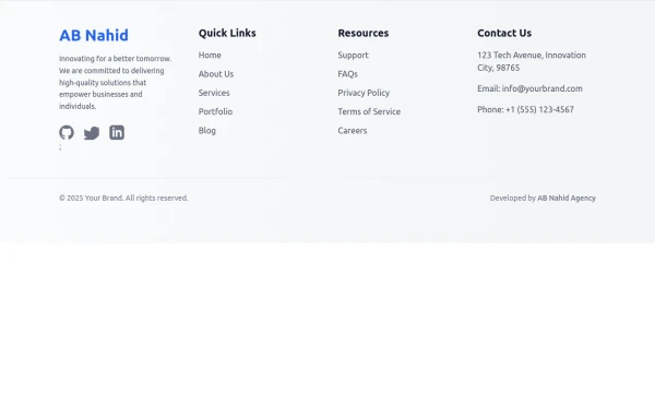 Responsive Light Mode Footer Component
This is a fully responsive and reusable light-mode footer component designed by ABNahid Agency. Built with a clean structure and optimized for modern web applications, this footer features essential sections, including About, Services, Contact, and Social Links. Ideal for personal portfolios, business websites, or startup platforms—plug and play in your React or HTML project.
-
-

-
 MULTI-STEP FORM component
MULTI-STEP FORM WIZARD · Open Source Component Steps: Personal → Role → Preferences → Goals → Review Features: stepper, validation, conditional fields, localStorage, animated transitions, review summary
361 -
-
 products, show, items
display images, card, products
-
Typewriter effect
using javascript
43.5k -
 Car booking form
Rental carr booking form to rent a car online
869






Browse by topic
Explore components by Tags
Jump straight to the UI pattern you need.
Can't find it?
Didn't find the component you were looking for?
Search across 3,000+ community-built components and grab the code in seconds.