status indicatior
status indicator navigation dashbord
This tailwind example is contributed by Rushikesh Latpate, on 03-Jan-2025. Component is made with Tailwind CSS v3. It is responsive.

Author Rushikesh Latpate
Related Examples
-
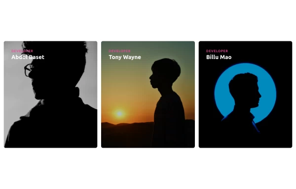
 magic card
by salvator
10 months ago1.2k -
 Responsive Cards with Hover Text Reveal Animation - Built with Tailwind CSS
nhance your website with these sleek, responsive cards designed using Tailwind CSS! Featuring a stylish hover animation, the text smoothly reveals when you hover over the card, adding a dynamic touch to your user interface. Perfect for portfolios, team profiles, or project showcases, this design adapts seamlessly to all screen sizes.
11 months ago1.9k -
 3 years ago12.5k
 -
 3 years ago19.2k
 -
 1 year ago2.7k
 -
 Websites built to perform beautifully.
We design high-impact websites that convert and scale. From sleek interfaces to full stack experiences, we bring your brand to life online.
1 month ago70 -
 masonary grids effect for cards using columns
As part of the redesign I was trying to think of ways to lay out testimonials from students, which may have varying length/content, I stumbled onto the idea of using a masonry layout (think bricks, think Pinterest).
1 year ago1.3k -
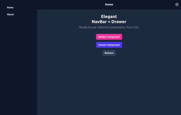 Elegant NavBar + Drawer
A NavBar, a responsive drawer/sidebar, and other useful Tailwind components to get started creating an app. Pure CSS, no JavaScript needed (although this example uses a bit of JS).
10 months ago1.4k -
 Multi Step form with javascript
A Beautiful multi step form using HTML CSS and JS
1 year ago1.4k -
 Health Tracker - Diet Calorie Management App
Health Tracker - Diet Calorie Management App
2 months ago157 -
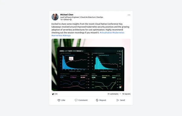 LinkedIn Post UI Mockup
A static HTML and Tailwind CSS component designed to replicate the user interface of a LinkedIn post. This mockup accurately represents the post structure including the header (avatar, name, headline, timestamp), content area (text, optional media), engagement statistics (likes, comments, reposts), and the action bar (Like, Comment, Repost, Send). It's fully responsive, supports light and dark themes, and uses appropriate iconography and styling to closely mimic the LinkedIn feed experience.
11 months ago1.3k -
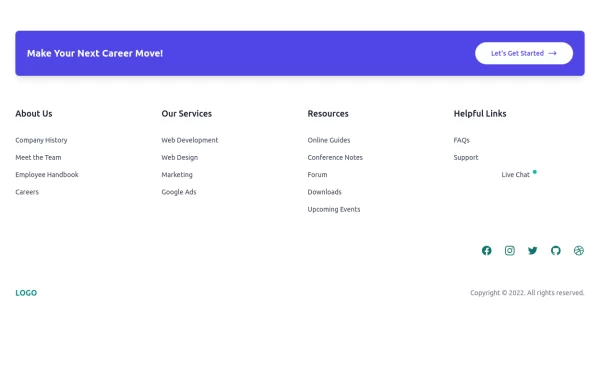 Clean & Responsive Footer Design with Tailwind CSS With CTA Button
modern and responsive footer built with Tailwind CSS to enhance website navigation, accessibility, and user experience. Featuring quick links, social media icons, copyright info, and a sleek layout, this SEO-friendly footer improves engagement and usability across all devices. Perfect for portfolios, business websites, and eCommerce stores!
11 months ago1.1k


Explore components by Tags
Didn't find component you were looking for?
Search from 3000+ components