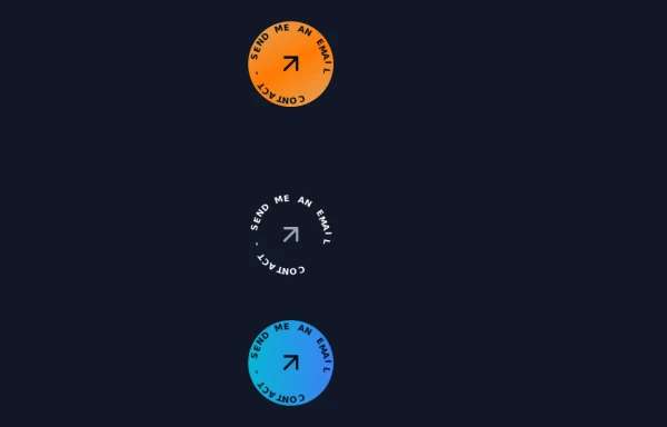
Tailwind Link Button
TailwindLink Button
This tailwind example is contributed by Geoffrey Callaghan, on 13-Nov-2023. Component is made with Tailwind CSS v3. It is responsive. It supports dark mode. similar terms for this example are Get in touch, Contact form

Author Geoffrey Callaghan
Related Examples
-
 3 years ago16.6k
 -
 Contact us form
Contact us form
2 years ago6.4k -
 Contact Spinner
Contact button spinning
1 year ago5.7k -
 3 years ago11.2k
 -
1 year ago2.1k
-
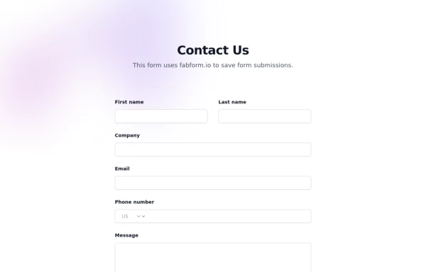
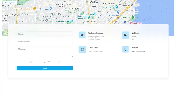 Contact us form with map
Contact us form with map
2 years ago12.4k -
 Animated Button
on hover show icon
1 year ago2.7k -
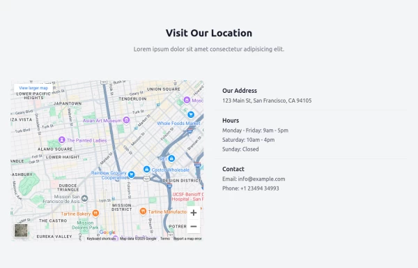 Visit us section with google map
useful for landing pages uses fabform.io
1 year ago2k -
 Get in touch tailwind contact form
Get in touch tailwind contact form
1 year ago2.3k -
 future ai robot
this an ai template by salvator
9 months ago1.2k -
 Sharp corner button design
button with hover effect
3 years ago12.7k -
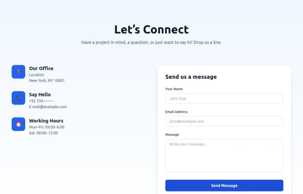 Modern Contact Section with Responsive Grid and Glassmorphic Form
A clean, professional contact section with a dual-column layout featuring contact details and a sleek glassmorphism-inspired form. Fully responsive with Tailwind CSS, supporting both light and dark modes.
7 months ago673


Explore components by Tags
Didn't find component you were looking for?
Search from 3000+ components