dsdd
dsdsd
This tailwind example is contributed by fem dev, on 28-Mar-2026. Component is made with Tailwind v3.4. It is responsive.

Related Examples
-
 Table Skeleton
Data table skeleton built with Tailwind CSS for admin dashboards and SaaS applications.
-
 background animation
704 -
 Certificate of Completion
A clean and modern certificate template built with Tailwind CSS. Ideal for courses, training programs, and professional achievements.
757 -

-
 Text Overlay Effect
This is a text overlay effect, featuring a subtle background title and a prominent foreground heading. This design enhances visual interest while maintaining a clean, modern aesthetic.
2.3k -
 Tag Input field
This code creates a dynamic tag input field using HTML, JavaScript, and TailwindCSS. Users can type tags into the input field and press "Enter" to add them. Each tag is displayed inside the input field as a styled container with a remove button. The tag input is limited to a maximum of 5 tags, and an error message is shown if the limit is exceeded. Users can remove tags to free up space for new ones. The input field and tags are styled using TailwindCSS, ensuring a clean and responsive design.
2.7k -
 LED Dot Matrix Display
-
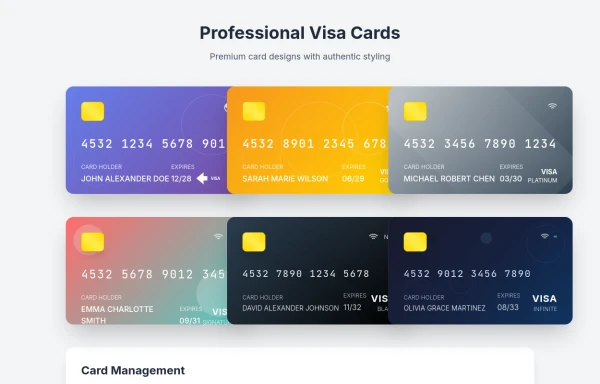 visacardes
I'll create professional Visa card components with realistic styling and multiple card types
1.2k -
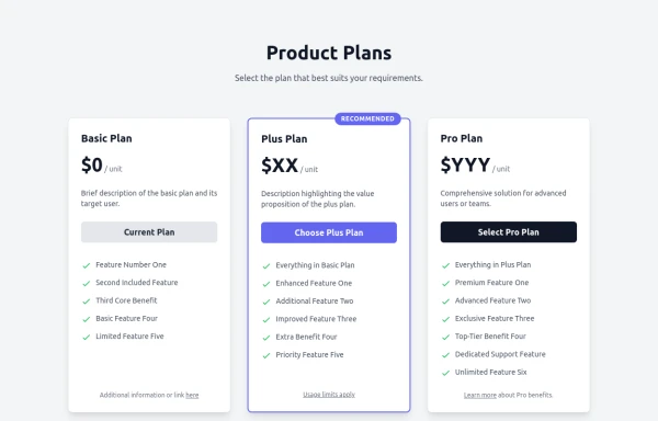 Responsive Multi-Tier Pricing Table Component
flexible and responsive 3-tier pricing table component built with HTML and Tailwind CSS. Features distinct visual styles for different plans (e.g., highlighting a recommended option), adapts to various screen sizes, and supports both light and dark color schemes. Uses generic placeholders for easy adaptation to any product or service.
2k -
 Button
 with scale animation on hover and translate-y on active
256 -
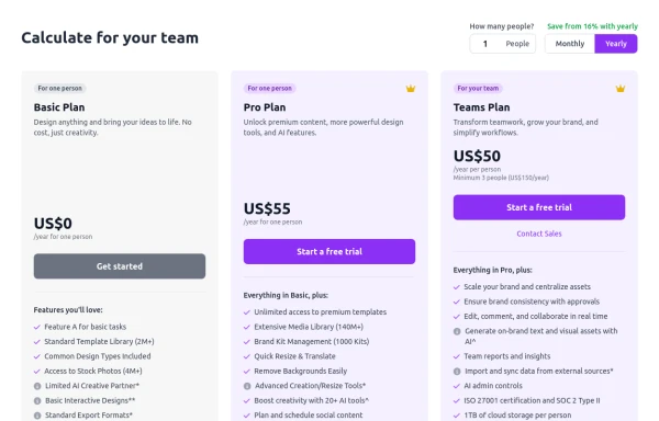 Configurable 3-Tier Responsive Pricing Table
A modern, responsive pricing table component inspired by SaaS layouts, built with HTML and Tailwind CSS. Features three distinct pricing tiers displayed in cards, stacking vertically on smaller screens and transitioning to a 3-column grid on large screens (lg breakpoint). Includes interactive top controls for selecting the number of users and toggling between monthly/yearly billing cycles. Each card uses placeholder content for icons, titles, descriptions, features (with checkmarks/info icons), and distinct call-to-action buttons, making it easily adaptable. Styled with subtle background colors and clear typography for excellent readability.
1.6k -








Browse by topic
Explore components by Tags
Jump straight to the UI pattern you need.
Can't find it?
Didn't find the component you were looking for?
Search across 3,000+ community-built components and grab the code in seconds.