Website Pricing List Card Component
A Website Pricing List Card Component is a reusable UI element that displays pricing plans or packages on a website, typically for SaaS products, subscriptions, or service tiers. It helps users easily compare different pricing options and choose the best one.
This tailwind example is contributed by dev-fab250, on 21-May-2025. Component is made with Tailwind v3.4. It is responsive. It supports dark mode.

Related Examples
-
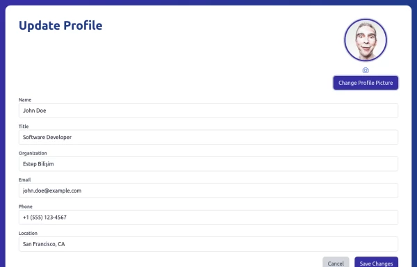 Update Profile
Update profile page with basic informations
3.6k -
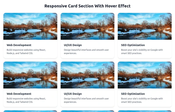 Responsive Card Section With Hover Effect
added more cards with ui friendly
984 -
 6.5k
6.5k -
 Responsive Cards with Hover Text Reveal Animation - Built with Tailwind CSS
nhance your website with these sleek, responsive cards designed using Tailwind CSS! Featuring a stylish hover animation, the text smoothly reveals when you hover over the card, adding a dynamic touch to your user interface. Perfect for portfolios, team profiles, or project showcases, this design adapts seamlessly to all screen sizes.
2.3k -

-

-

-

-
 24.2k
24.2k -

-
 KPI Cards
estilo Shopify / Stripe
-







Browse by topic
Explore components by Tags
Jump straight to the UI pattern you need.
Can't find it?
Didn't find the component you were looking for?
Search across 3,000+ community-built components and grab the code in seconds.