Tailwind AoPS Demo - Isabel
Starter code for an interactive Tailwind Demo
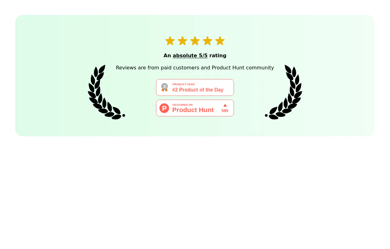
This tailwind example is contributed by Isabel McGuigan, on 21-Jun-2024. Component is made with Tailwind CSS v3. It is responsive.

Author Isabel McGuigan
Related Examples
-
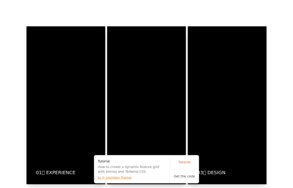
 Responsive Cards
Responsive Cards
1 month ago165 -
 Kids E-learning Platform Card
Kids E-learning Platform Card Clone
1 year ago1.8k -
 1 year ago7k
 -
 Swipe card fully animative
@sufyandevs #sufyandevs #sufyandev #shanwebdev
4 months ago695 -
 Admin dashboard cards
Card groups for showing stats/info. Change it for responsiveness for small and medium screen
1 year ago2.9k -
 Weather card
Component was one shot generated using https://inspi.me
2 months ago367 -
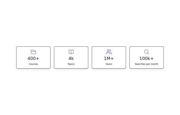 Stats card with icons
Improved Code quality and added support for dark mode
1 year ago1.8k -
 Profile Card
User profile card
4 months ago182 -
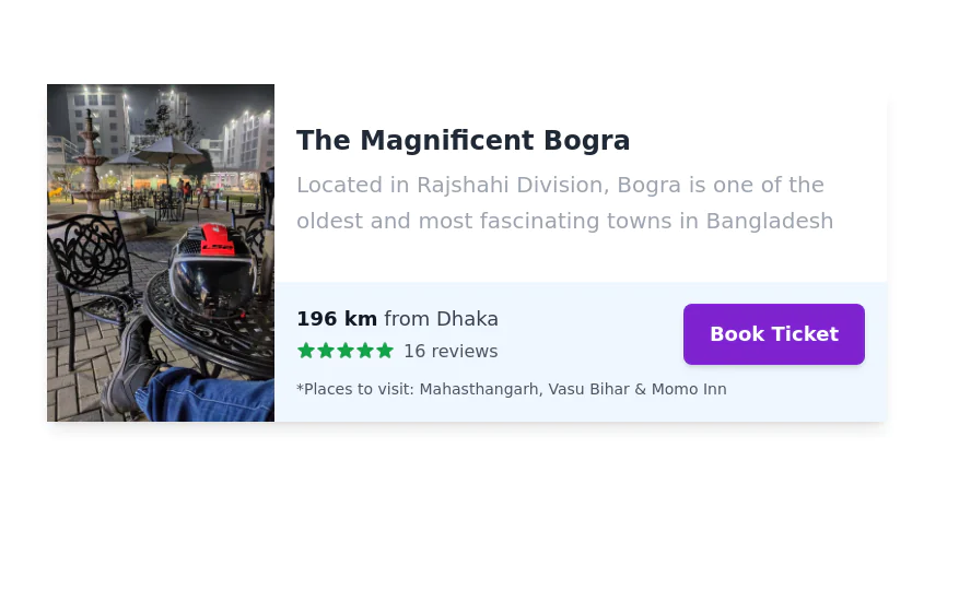 Service/Product card
Tour trip booking showcase card
3 years ago13.1k -
 3 years ago15.8k
 -
 Card Component
This component is a simple card (without image) component with hover effect & Dark mode Supported & full responsive
2 years ago3.6k -
 3 years ago10.6k


Explore components by Tags
Didn't find component you were looking for?
Search from 3000+ components