Button group
This tailwind example is contributed by Conan Hilton, on 28-Jul-2022. Component is made with Tailwind CSS v3. It is responsive.

Author Conan Hilton
Related Examples
-
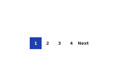
 Previous Next Buttons
Pagination buttons
3 years ago14.5k -
 Boutons iOS 26
Boutons iOS 26
3 months ago591 -
 chat ui advanced
Professional chat ui, connect me for jsx https://abhirajk.vercel.app/
1 year ago1.8k -
 3 years ago11k
 -
 3 years ago10.3k
 -
 3 years ago10k
 -
 3 years ago16.2k
 -
 FLESH & BONE
Stranded in the heart of a cannibal-infested jungle, you must make unthinkable choices to survive. How far will you go to see another sunrise?
4 months ago382 -
 Adminpanel
Three tabs, switch between each other, change color when clicked. Tables with filter, search, with a drop-down form to fill.
1 year ago1.8k -
 Sharp corner button design
button with hover effect
3 years ago12.8k -
 Radio Button Group for Search Filters
set of radio buttons grouped for selecting different search filters
2 years ago5.6k -
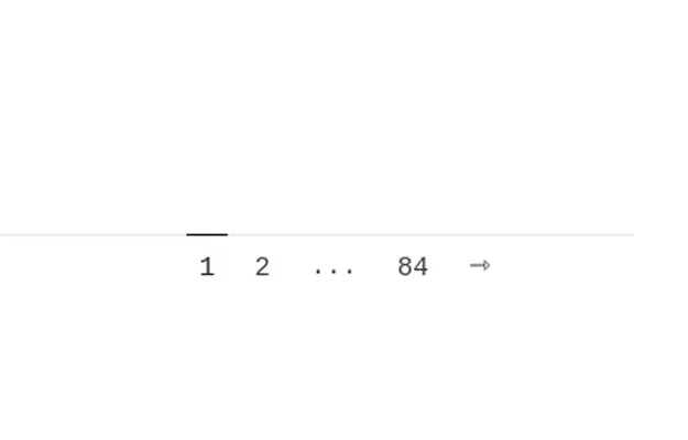
 Pagination - Htmlwind
Centered numbers pagination
9 months ago932


Explore components by Tags
Didn't find component you were looking for?
Search from 3000+ components