Plant Game
Checking to see if it works
This tailwind example is contributed by Becky Keyworth, on 02-May-2025. Component is made with Tailwind v3.4. It is responsive. It supports dark mode.

Related Examples
-
 loginForm2
form
69 -

-

-

-
 Snake Game tailwind
snake game
1.4k -

-
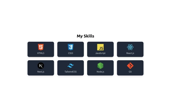 Skills Showcase, My Tech Stack and Expertise & Skills
🚀 Showcasing My Skills with TailwindCSS & Flexbox! I’ve designed a responsive and interactive Skills Section using Tailwind CSS and Flexbox. With smooth hover effects and a clean layout, this section highlights my expertise in: 🔹 Frontend Technologies – HTML, CSS, JavaScript, React, Next.js 🔹 Styling Frameworks – TailwindCSS 🔹 Backend & Tools – Node.js, Git
-
-
 Tag Input field
This code creates a dynamic tag input field using HTML, JavaScript, and TailwindCSS. Users can type tags into the input field and press "Enter" to add them. Each tag is displayed inside the input field as a styled container with a remove button. The tag input is limited to a maximum of 5 tags, and an error message is shown if the limit is exceeded. Users can remove tags to free up space for new ones. The input field and tags are styled using TailwindCSS, ensuring a clean and responsive design.
49 -
 Energy Efficiency Program - Oklahoma
Code for new IT proposal
850 -
 Irish Destination
For Irish road signs Destination
245 -
 trusted by
1. Color Scheme: 1. Updated the background to a gradient from Indigo-800 to Blue-900 2. Changed text colors to use Indigo-800 and Blue-900 shades 3. Updated ring colors on avatar images to match the new scheme 2. Enhanced Design: 1. Added a containing card with white background (dark gray in dark mode) 2. Increased the size of avatar images for better visibility 3. Added a shadow effect to the card that changes color on hover 3. Responsiveness: 1. Maintained the responsive layout, stacking vertically on smaller screens 4. Animations and Interactions: 1. Added a fade-in animation for the entire component 2. Enhanced hover effects on avatar images (scale and z-index change) 3. Added a ring effect on hover for each avatar 5. Accessibility: 1. Maintained alt text for images 2. Ensured proper color contrast for text readability 6. Dark Mode: 1. Implemented dark mode support 2. Adjusted colors and ring effects for dark mode 7. Additional Enhancements: 1. Increased font sizes for better readability 2. Added font weight variations to emphasize important text 3. Improved spacing and alignment This updated component maintains the original functionality while incorporating the Indigo-800 and Blue-900 color scheme and adding enhanced visual effects and interactions.
2.3k







Browse by topic
Explore components by Tags
Jump straight to the UI pattern you need.
Can't find it?
Didn't find the component you were looking for?
Search across 3,000+ community-built components and grab the code in seconds.