split bg
This tailwind example is contributed by Anonymous, on 04-Jun-2025. Component is made with Tailwind CSS v3.

Author Anonymous
Related Examples
-
 11 months ago1.2k
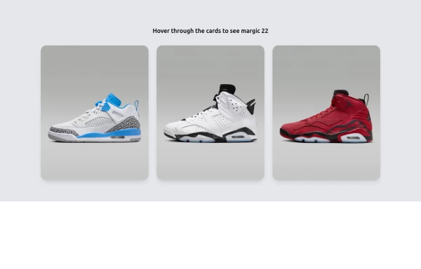
 -
 Card profile
profile card
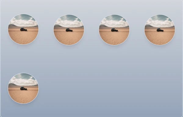
2 years ago2.9k -
 Premium High-Performance Web Gaming Hub
Experience the future of browser-based gaming. I’ve developed a premium arcade hub designed for speed, clarity, and zero-latency gameplay. Built with modern web technologies, Ayyamperumal Games brings AAA-inspired visuals and high-octane mechanics directly to your browser—no downloads, no lag, just pure performance. Explore a curated library of titles ranging from minimalist logic puzzles like Sudoku Elite to fast-paced action in Neon Drift. This is where clean code meets high-level entertainment.
2 months ago286 -
 User Profile Sidebar Menu
A clean and modern user profile sidebar menu built with TailwindCSS. This component displays a user’s profile picture, name, and a vertical navigation menu with links such as Dashboard, Order History, Account Details, Address, Reviews, and Logout. Ideal for account dashboards in web applications, the design features rounded corners, subtle shadows, and interactive hover effects, delivering a smooth and user-friendly experience.
1 year ago1.5k -
 Play Music - Reproductor
Multimedia music player, with its respective dark mode
1 year ago2.6k -
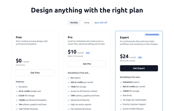 Modern Responsive Pricing Section with Toggle
A sleek, responsive pricing section built with HTML and Tailwind CSS, showcasing three distinct plans (e.g., Free, Pro, Expert) in a card layout. It features a clean monthly/yearly toggle switch with savings indication, highlights a recommended plan with distinct styling and a badge, and uses checkmarks for clear feature comparison. The layout stacks vertically on smaller screens and transitions to a 3-column grid on large screens (lg breakpoint). Includes generic content for easy adaptation and a final "Compare Plans" button.
10 months ago1.1k -
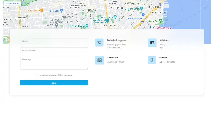 Contact us form with map
Contact us form with map
2 years ago12.4k -
 Custom Success Page
This code provides a clean, modern and informative look.
3 weeks ago41 -
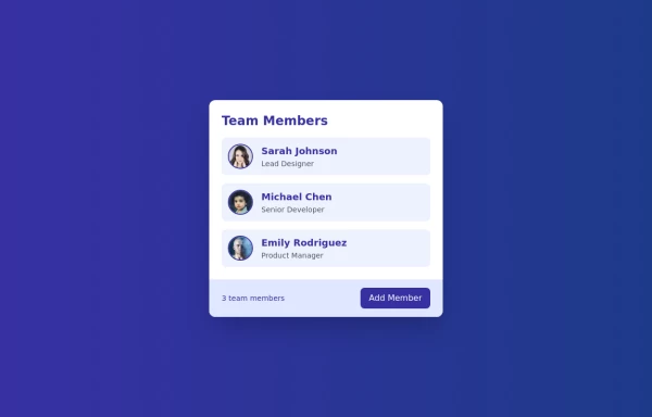 Cards - Users Card
This Users Card design includes: 1. Responsive layout using Flexbox 2. Indigo-800 and Blue-900 color scheme 3. Dark mode support 4. User list with avatars, names, and roles 5. Hover effects on user items 6. "Add Member" button 7. Card footer with team member count 8. Subtle animations and transitions 9. Accessibility considerations (proper heading structure, color contrast) Key features: - The background uses a gradient from Indigo-800 to Blue-900 - The card has a white background in light mode and dark gray in dark mode - Text colors are adjusted for readability in both light and dark modes - User avatars have a border color that changes in dark mode - User items have a hover effect that scales them slightly - The "Add Member" button uses Indigo-800 with a Blue-900 hover state - Dark mode is automatically applied based on system preferences - The entire card fades in on load for a smooth entrance - The card has a hover effect that enhances its shadow This design provides a clean, professional look for displaying team members while incorporating the requested color scheme and maintaining good usability across different devices and color modes.
1 year ago2.4k -
 Amazing E-commerce card 2
An amazing e-commerce card with stunning hover effect 2
1 year ago1.7k -
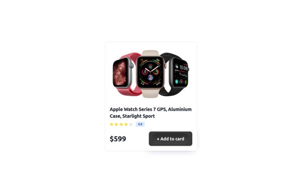
 8 months ago458
 -
 Card
CardSimple Card
1 year ago1.8k


Explore components by Tags
Didn't find component you were looking for?
Search from 3000+ components