component1
this is for demo
This tailwind example is contributed by Anonymous, on 26-Sep-2026. Component is made with Tailwind v3.4. It is responsive.

Related Examples
-
 Creative Bento Gallery
A modern bento-style gallery combining differently sized image cards in a structured and visually engaging layout.
308 -
 Ripple Animation
Component is made with Tailwind CSS v3. It is responsive. It supports dark mode. similar terms for this example are loading, loader,Author box, User information,Transitions
793 -
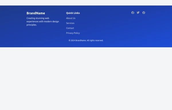 Modern Responsive Footer with Tailwind CSS
This sleek and modern responsive footer is built using HTML and Tailwind CSS. It features three sections: brand information, useful links, and social media icons. The footer includes smooth hover effects, subtle fade-in animations, and a fully responsive design that adapts seamlessly to different screen sizes. Perfect for websites looking for a professional and stylish footer section.
2.7k -

-
 Table Skeleton
Data table skeleton built with Tailwind CSS for admin dashboards and SaaS applications.
-

-
 Download App Buttons
Ready-to-use Apple App Store and Google Play Store download buttons with official branding and styling
856 -
-

-

-
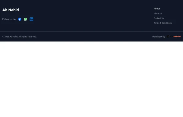 Footer
Elevate your website design with this sleek and minimalist light mode footer component by AB NAHID AGENCY. Crafted for clean UI experiences, it’s perfect for modern web apps, blogs, and business platforms. Easy to integrate, fully responsive, and built with scalability in mind—designed to blend seamlessly with any light-themed layout.
-
 Product cards
Product cards for eCommerce
1.4k


Browse by topic
Explore components by Tags
Jump straight to the UI pattern you need.
Can't find it?
Didn't find the component you were looking for?
Search across 3,000+ community-built components and grab the code in seconds.