Bento grid
This tailwind example is contributed by Anonymous, on 29-Oct-2026. Component is made with Tailwind v3.4. It is responsive.

Related Examples
-
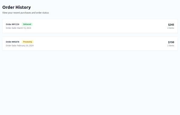 Order History
-

-
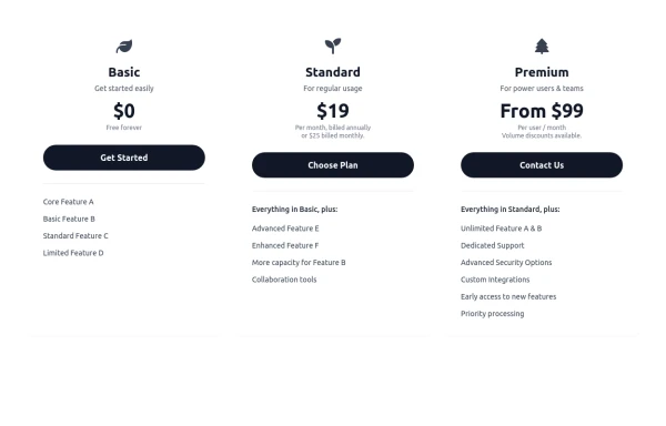 Responsive 3-Tier Pricing Card Section
A clean and responsive pricing table component featuring three distinct tiers (e.g., Basic, Standard, Premium) presented in a card layout. Built with HTML and Tailwind CSS, it stacks vertically on small screens and transitions to a side-by-side view on medium screens (md breakpoint - 768px) and up. Each plan card includes a placeholder icon, title, description, price details, a call-to-action button, and a bulleted list of features with checkmarks. The generic content makes it easy to adapt for various websites or applications needing a clear pricing comparison structure.
986 -
 Muhammad Umair Arshad - Frontend Developer Resume | React, TypeScript, Tailwind CSS
Professional resume of Muhammad Umair Arshad, a skilled Frontend Developer specializing in React, TypeScript, and Tailwind CSS. I build high-performance web applications with responsive UI design.
-
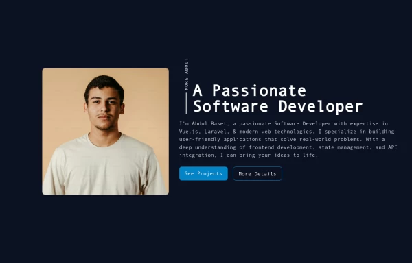 Responsive About Section with Tailwind CSS
Built a sleek and fully responsive About Section for my portfolio using Tailwind CSS! 🚀 Designed for smooth adaptability across all screen sizes with a modern and minimal aesthetic. Perfect for showcasing skills, experience, and a personal touch!
-
-
 MULTI-STEP FORM component
MULTI-STEP FORM WIZARD · Open Source Component Steps: Personal → Role → Preferences → Goals → Review Features: stepper, validation, conditional fields, localStorage, animated transitions, review summary
479 -

-
 The Free AI Tools Grid Section (210+ Tools, No Signup)
A responsive and SEO-optimized grid section showcasing over 210 free AI tools. Designed with Tailwind CSS, fully responsive, fast-loading, and built for high user engagement. No sign-up required, privacy-friendly, and optimized for performance and discoverability.https://www.thefreeaitools.com/
636 -

-
 The Life of a Singularity
 is the story of one powerful idea evolving into endless possibilities. It symbolizes innovation, intelligence, and the continuous pursuit of creating smarter, faster, and more connected experiences.
112 -
 Full HTML Version
What's Included: Title*: Required input Description: Optional textarea Fully responsive and dark mode ready Simple validation (required on title)











Browse by topic
Explore components by Tags
Jump straight to the UI pattern you need.
Can't find it?
Didn't find the component you were looking for?
Search across 3,000+ community-built components and grab the code in seconds.