Simple Sign-up Box
It features a backdrop blur effect on a dark background, creating an elegant and modern look.
This tailwind example is contributed by Anja Müller, on 04-Oct-2023. Component is made with Tailwind v3.4. It is responsive. similar terms for this example are Register, Sign in

Related Examples
-
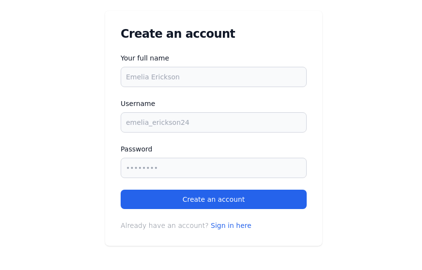
 Login popup modal
centered modal for gaining more attention from users, it also has social login buttons.
18.3k -
-
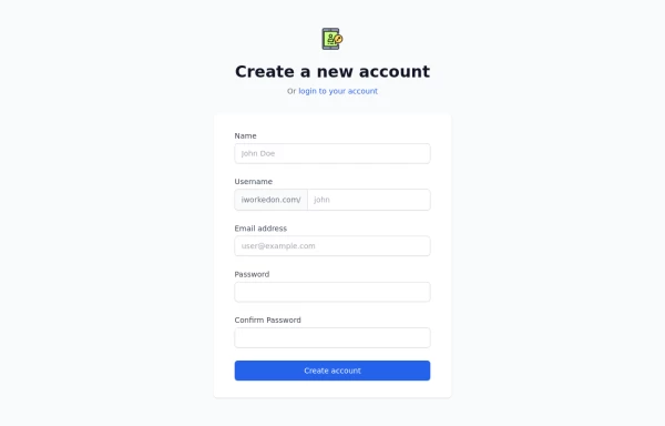
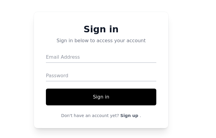
 Simple Login Form
Very basic responsive login form. The form is centered within a white card with a shadow, featuring input fields for username and password. The design is clean and user-friendly.
50.6k -
-
-
 Responsive registration form
form with social login buttons
46.8k -
 Login page with tailwind (SB admin 2)
This component features a split-screen design with a background image on one side and a registration form on the other.
24.9k -

-
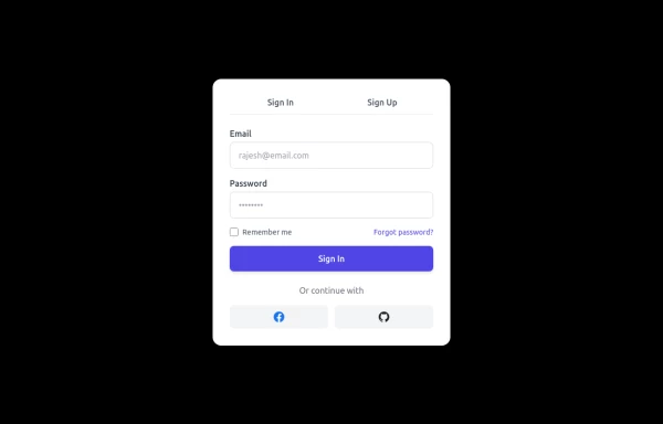 SingIn / Signup Form
A modern and responsive authentication card with Sign In & Sign Up options, featuring a seamless toggle and social login (Facebook, GitHub). Designed with Tailwind CSS, it offers a clean UI, smooth transitions, and full mobile responsiveness.
-

-
 Responsive Login & Support Form
A responsive login page for an order and production management system. It features a branded navigation bar, username and password fields, a clear sign-in action, and a built-in support message form with attachment and emoji controls. Built with Tailwind CSS and Flowbite, the layout adapts smoothly to desktop and mobile screens. Tags: Login Form, Authentication, Contact Form, Support Form, Responsive, Navbar, Footer, Tailwind CSS, Flowbite, Admin Panel
127 -
 Interactive Multi-Method Donation Section
Overview: A high-trust, conversion-oriented fundraising section styled in the project's signature Navy Blue theme. It provides users with flexible payment options, ranging from one-click fixed amounts to manual bank transfers and cryptocurrency donations. Key Features: Smart Amount Logic: Includes a JavaScript-powered selector where users can choose a preset amount ($10, $25, $50) or type a custom value. The interface automatically toggles states (deselecting buttons when typing, and vice-versa) to prevent user error. Payment Methods: Quick Card/Checkout: Primary call-to-action column. Bank Transfer: A clean card displaying account details with a "Copy to Clipboard" utility. Crypto (Bitcoin): A specialized dark-themed card featuring a placeholder QR code and wallet address copying functionality. Trust Signals: Includes security iconography (lock, shield) and reassuring copy to boost donor confidence. Visual Hierarchy: Uses a 7/5 grid split to prioritize the immediate donation action while keeping manual payment methods accessible but secondary. Tech Stack: Framework: Tailwind CSS. Icons: Ionicons. Scripting: Vanilla JavaScript (for amount toggling and clipboard copying functions). Fonts: DM Serif Display (Headings) + Inter (Body). Usage: Ideal for the "Support Us" page or a dedicated campaign landing page. The script tag included at the bottom handles all the interactivity (button selection and text copying) without needing external libraries.
1.2k








Browse by topic
Explore components by Tags
Jump straight to the UI pattern you need.
Can't find it?
Didn't find the component you were looking for?
Search across 3,000+ community-built components and grab the code in seconds.