beautifull project Item
This tailwind example is contributed by Akram Khan, on 07-Jul-2024. Component is made with Tailwind CSS v3. It is responsive.

Author Akram Khan
Related Examples
-
 Profile Card
Simple and Attractive Profile card in tailwind css
7 months ago736 -
 10 months ago2.2k
 -
 11 months ago2.2k
 -
 3 years ago12.2k
 -
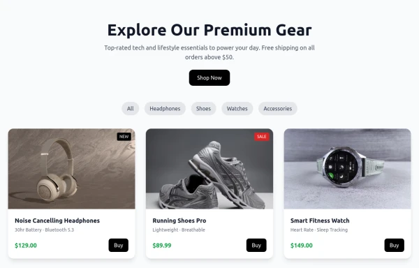 Shop Now Amazon x
Product cards
8 months ago1.4k -
 10 months ago1k
 -
 Blog post cards
responsive blog post cards
3 years ago12.8k -
 The Future of Web Development
love my product
8 months ago885 -
 medical care
It will help us get medical care quickly using a card and make it possible for all of us, Rwandans and other people in other countries, to have a better life.
8 months ago401 -
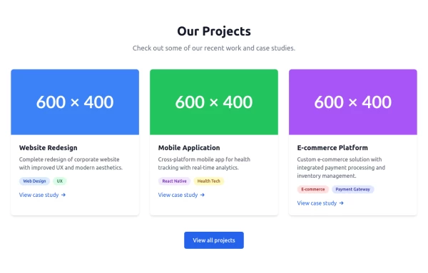
 3D Modern Pricing Card
Here's a modern, reusable Pricing Card component that's highly popular on platforms like TailwindFlex. It's clean, responsive, and designed for conversions.
8 months ago779 -
 Tailwind Card Components
A collection of 20+ copy-paste ready card components built with pure HTML and Tailwind CSS. Includes product cards, profile cards, article cards, pricing cards, testimonials, and notifications.
4 months ago562 -
 7 months ago1k


Explore components by Tags
Didn't find component you were looking for?
Search from 3000+ components