Simple responsive cards
This tailwind example is contributed by Shakti, on 23-Mar-2023. Component is made with Tailwind CSS v3. It is responsive.

Author Shakti
Related Examples
-
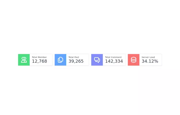 Admin dashboard cards
Card groups for showing stats/info.
3 years ago21.6k -
3 years ago32.4k
-
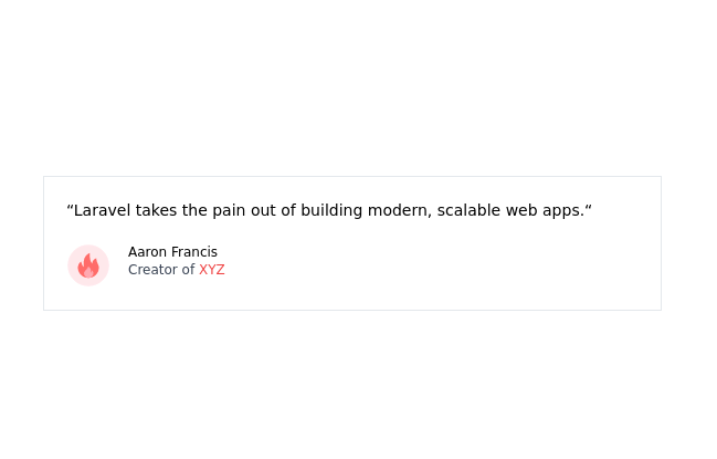
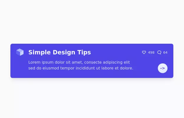 Info Card
info card with description
3 years ago13k -
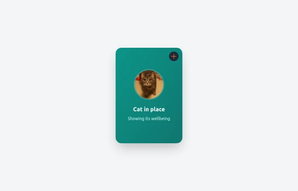
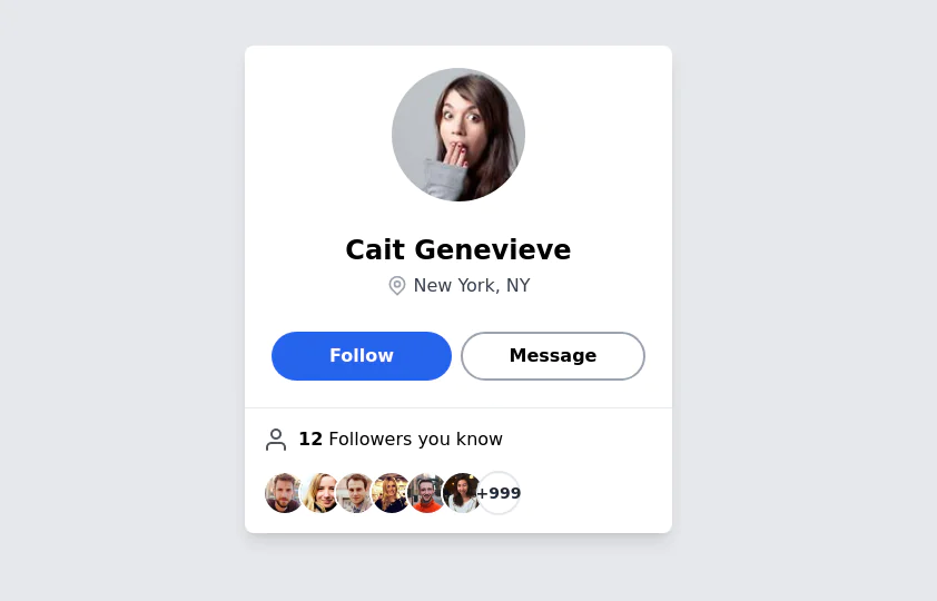 User Profile Card
The card features a user's profile picture, name, location, and options for interactions. It has a clean and modern design with rounded edges and icons for user engagement. It also has support for dark mod:
3 years ago64.4k -
 1 year ago2k
 -
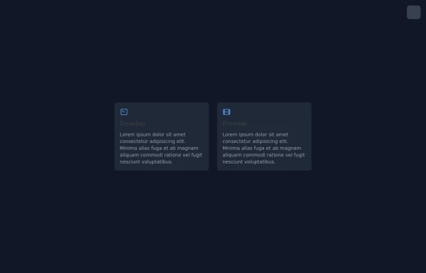
 Expandable Card
An expandable card using tailwind + alpine to show additional information when it is open
5 months ago505 -
 Pagination
It's my first project which i made him in the using tailwind css and html
4 months ago219 -
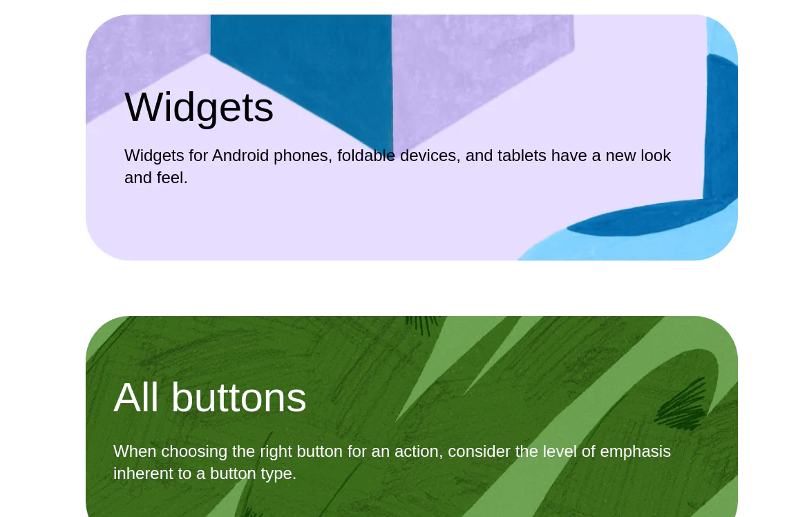 google ui cards
google ui cards
2 years ago9.9k -
 Free SEO Audit & Analysis Tool
Instant SEO analysis of your website. Check 50+ ranking factors including on-page SEO, technical issues, and mobile performance.
4 months ago436 -
 3 years ago9.1k
 -
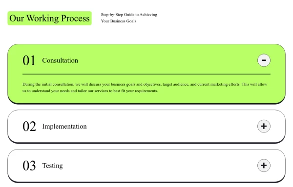 Responsive Working Process Section
This modern and responsive "Our Working Process" section adapts seamlessly to all screen sizes, ensuring a smooth user experience. The design follows a structured step-by-step layout with clear typography, bold colors, and interactive elements, making it perfect for showcasing business processes or workflows.
11 months ago1.1k -
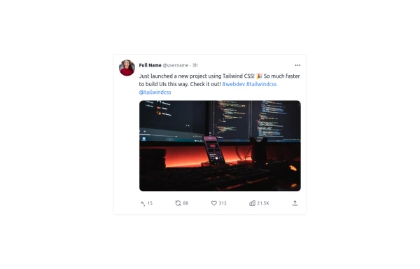 Twitter Post (Tweet) UI Mockup
A detailed static HTML and Tailwind CSS component replicating the user interface of a single Twitter post (Tweet). This mockup includes the user avatar, tweet header (name, handle, timestamp), tweet text with styled hashtags/mentions, optional media display, and the action bar with icons and counts (Reply, Retweet, Like, Views, Share). It is responsive, supports light and dark modes, and uses accurate iconography and hover states to closely resemble the real Twitter UI.
11 months ago780


Explore components by Tags
Didn't find component you were looking for?
Search from 3000+ components