
Impact
-
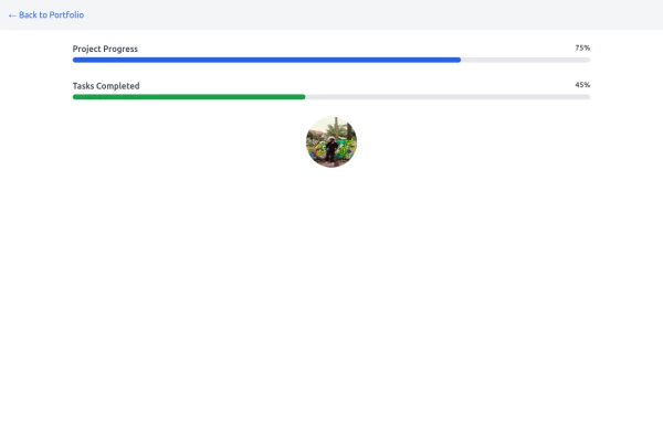 Progress Bar
A progress bar is a UI element that visually represents the completion status of a task or process. It helps users understand how much of a task has been completed and how much remains. Commonly used in forms, file uploads, loading screens, or multi-step processes, it enhances the user experience by providing clear feedback.
1 year ago924 -
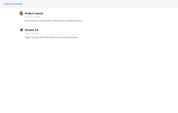 Timeline
timeline with journey
1 year ago1.2k -
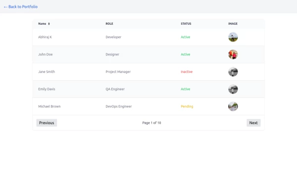 Table
TableTable with image and status with pagination buttons
1 year ago2.5k -
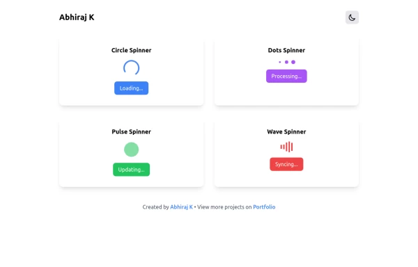 Spinner
The Spinner is a simple and visually appealing component that indicates ongoing processes like loading or data fetching. It's a great way to improve user engagement and reduce frustration during wait times. Different styles and animations (circular, dots, pulsating). Customizable size, color, and speed. Easy to integrate with loading states in any app. Lightweight and responsive.
1 year ago2.1k -
 Skeleton Loader
The Skeleton Loader is a placeholder component that creates a smooth loading animation to mimic the layout of the actual content. It enhances user experience by setting clear expectations during data loading. Supports different shapes (rectangles, circles, etc.). Adjustable sizes and durations for animation. Works well with dynamic content such as cards, text, or images. Highly customizable and responsive.
1 year ago2.3k -
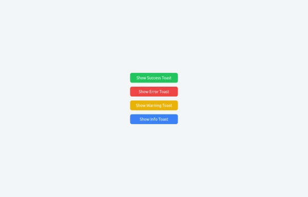 Notifications
Toast Notifications are lightweight and customizable components for displaying short messages or alerts. They are perfect for feedback on user actions, such as form submissions or system updates. Supports different types of notifications (success, error, warning, info). Automatically hides after a specified timeout. Option to include action buttons or close icons. Customizable styles, animation, and position on the screen.
1 year ago1.1k -
 404 Page
The 404 Page is a responsive and customizable error page designed to inform users when they’ve reached a nonexistent or broken link. This component not only improves user experience but also provides a chance to showcase creativity and guide users back to the right path. Key Features: Fully responsive design that works on all devices. Engaging visuals (customizable images, icons, or animations). Includes a message like "Page Not Found" or "Oops! Something went wrong." Provides helpful navigation options such as a "Go Home" button or links to other pages. Easily customizable for themes, styles, and content.
1 year ago2.1k -
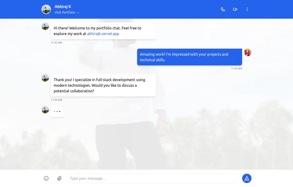 Chat UI
The Chat UI is a responsive and interactive component designed for building messaging interfaces. Ideal for applications like customer support, social media, or team collaboration tools, it provides a modern, user-friendly layout for real-time communication.
1 year ago2.9k -
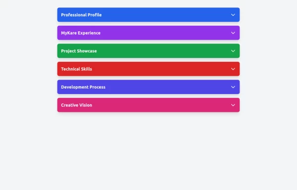 Accordion
The Accordion is a responsive and reusable component designed to display collapsible content sections. It's perfect for FAQs, menu items, or any other grouped information. Each section can expand or collapse individually to show or hide content. Features: Mobile-friendly and fully responsive design. Smooth animation for opening and closing panels. Supports multiple or single panel expansion. Highly customizable with props for colors, fonts, and behavior (e.g., single/multiple open panels). Accessible with keyboard navigation and ARIA attributes.
1 year ago1.9k -
 responsive slider carousel
slider carousel
1 year ago2.3k -
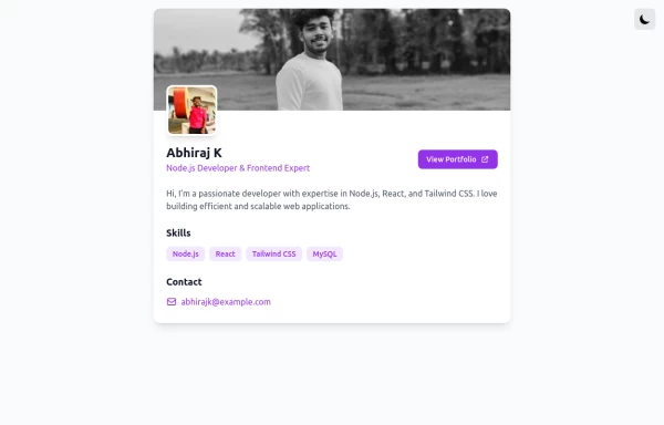
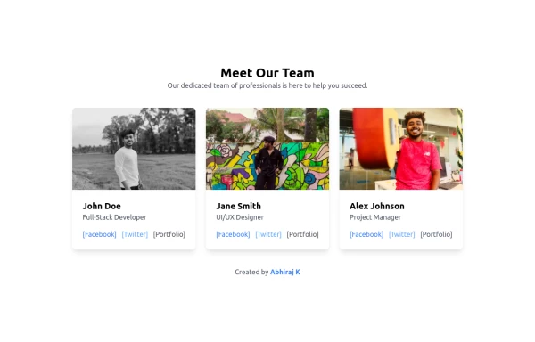 Team Members Showcase with Portfolio Backlink
Showcase your team's talent with this beautifully designed and responsive team members grid. Each card includes the member's photo, name, role, and social links. A special portfolio backlink is included to highlight your personal contributions as a developer. Supports light and dark modes.
1 year ago1.7k -
 profile page
profile page
1 year ago2k