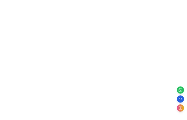
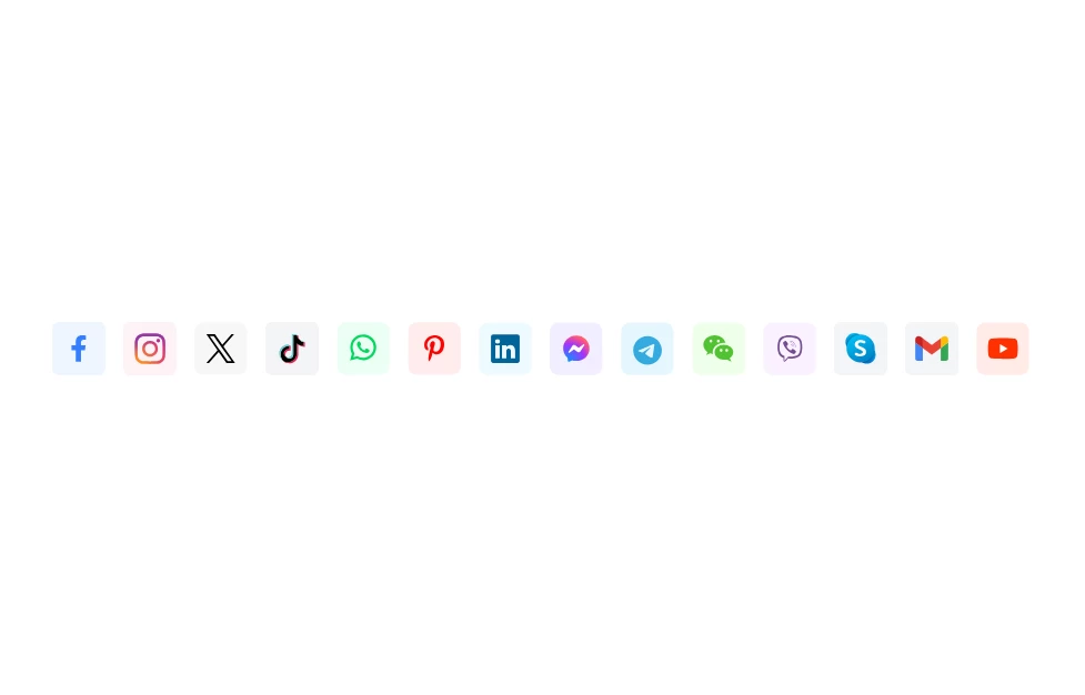
Sticky Floating Social Bar
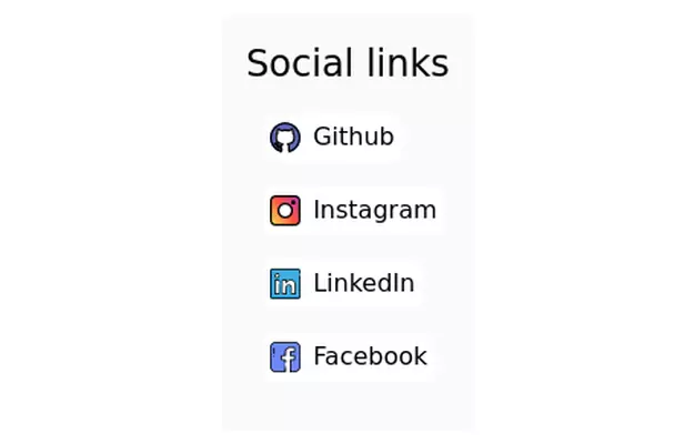
Overview: A fixed, right-aligned sidebar component designed to display social media links (Facebook, Instagram, WhatsApp). It remains visible while scrolling and features an interactive "drawer-like" expansion effect on hover.
Key Features:
Sticky Positioning: Fixed vertically centered on the right edge of the viewport (fixed top-1/2 right-0).
Isolated Hover Effect: When a user hovers over an icon, only that specific item expands to reveal the text and changes to its brand color.
Stable Layout: Uses items-end flex alignment to ensure non-active icons remain perfectly stationary while one expands, preventing layout shifting.
Smooth Transitions: Includes CSS transitions for width, background color, and text opacity.
Tech Stack:
Framework: Tailwind CSS (Utility classes).
Icons: Inline SVGs.
Interactivity: Pure CSS (hover states), no JavaScript required.
Usage: Place this code block directly before the closing </body> tag to ensure it sits on top of all other content (z-50).
This tailwind example is contributed by Juan D. Cortorreal, on 23-Nov-2025. Component is made with Tailwind CSS v3. It is responsive. similar terms for this example are Social media links,

Author Juan D. Cortorreal
Related Examples
-
 Floating Action Button
This component displays a fixed, floating contact button panel positioned at the bottom-right corner of the screen. It provides users with quick access to key communication channels including WhatsApp, Email, and Instagram. Each icon is styled with vibrant, platform-specific colors and includes subtle hover animations for an interactive user experience. Ideal for improving accessibility and encouraging user engagement, especially on mobile devices.
8 months ago1.3k -
 2 years ago9.1k
 -
 logout
logout
6 months ago484 -
 2 years ago41.3k
 -
 Game changer
by salvator
7 months ago723 -
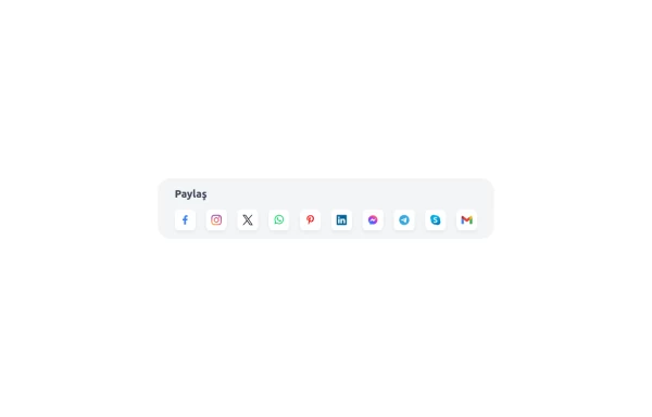
 Social Media Icons
Social Media Icons
1 year ago2.1k -
 hero page
by salvator
7 months ago1.5k -
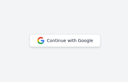 Continue with Google button
Login with google button for social login.
2 years ago24.4k -
 Modern Responsive Footer with Tailwind CSS
This sleek and modern responsive footer is built using HTML and Tailwind CSS. It features three sections: brand information, useful links, and social media icons. The footer includes smooth hover effects, subtle fade-in animations, and a fully responsive design that adapts seamlessly to different screen sizes. Perfect for websites looking for a professional and stylish footer section.
10 months ago1.8k -
 Social Media Icons
Social Media Icons
1 year ago1.9k -
 Modern Dark Footer with Overlapping Gradient CTA
A comprehensive, dark-themed website footer component built with HTML and Tailwind CSS. It features a visually distinct overlapping section with a colorful gradient background containing a prominent call-to-action (CTA) block. The main footer area utilizes a multi-column grid layout for organized navigation links, a newsletter signup form, and social media icons. A final bottom bar includes legal links and copyright information. The design is responsive and adapts its layout for different screen sizes.
8 months ago1k -
 2 years ago12.4k


Explore components by Tags
Didn't find component you were looking for?
Search from 3000+ components