39+ Free Carousel examples in Tailwind CSS
-
 1 year ago2.8k
 -
-
 Slider
Responsive slider
1 year ago2.4k -
 11 months ago2.5k
 -
 10 months ago1.7k
 -
 Simple Animated Carousel
A simple, animated 2:1 carousel with touch swipe support, based on perky98/Juraj's carousel.
9 months ago1.2k -
 slider /carousel
simple slider or carousel
9 months ago1.2k -
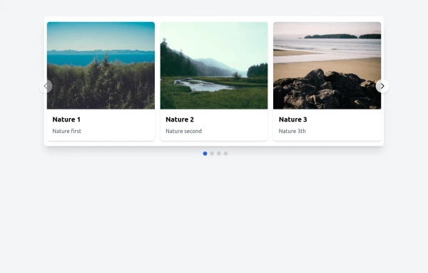 Responsive Image Carousel with Alpine.js
This component is a fully responsive image carousel/slider that displays: 1 slide at a time on mobile devices (screen width < 768px) 3 slides at a time on desktop (screen width ≥ 768px)
8 months ago1.7k -
 Hero Slider with Alpine.js
This responsive hero slider features full-screen image backgrounds with elegant text overlays and smooth transitions.
8 months ago2k -
 Premium Testimonial Carousel
It is a premium Testimonial Carousel
8 months ago1.6k -
 ArtoGallery
Explore a curated selection of contemporary and classic artwork, connecting collectors and creators in an inspiring online space.
8 months ago1.2k -
 Hero Section
Responsive Hero Section for you Project Background Image: A stunning, high-quality Unsplash photo that creates a unique visual impact. Overlay: Semi-transparent black overlay with blur effect for readability and a modern aesthetic. Content Area: Centered with a gradient background overlay for contrast, bold headline, engaging subtext. Buttons: Vibrant gradient and clean border with smooth hover animations to draw attention. Responsive Design: Looks great on all screen sizes with adaptable padding and font sizes.
7 months ago1.5k -
 Responsive Image Carousel with Alpine.js
This component is a fully responsive image carousel/slider that displays: 1 slide at a time on mobile devices (screen width < 768px) 3 slides at a time on desktop (screen width ≥ 768px)
3 months ago236 -
 Responsive Image Carousel with Alpine.js
This component is a fully responsive image carousel/slider that displays: 1 slide at a time on mobile devices (screen width < 768px) 3 slides at a time on desktop (screen width ≥ 768px)
3 months ago190 -
 Responsive Image Carousel with Alpine.js
This component is a fully responsive image carousel/slider that displays: 1 slide at a time on mobile devices (screen width < 768px) 3 slides at a time on desktop (screen width ≥ 768px)
3 months ago366


Didn't find component you were looking for?
Search from 3000+ components