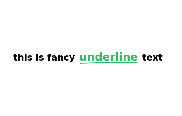
blog component
good blog
This tailwind example is contributed by Uwera Dorcas, on 27-May-2025. Component is made with Tailwind CSS v3. It is responsive.

Author Uwera Dorcas
Related Examples
-
 Life Tree
by salvator
9 months ago954 -
 Taskify Premium Task Management FREE
Website Task management modern and responsif
3 weeks ago87 -
 3 years ago12.6k
 -
 Custom Audio Player
🎧 Custom Audio Player (HTML, Tailwind CSS & Alpine.js) A modern, responsive custom audio player built with Tailwind CSS and Alpine.js, designed for a smooth user experience and elegant visuals in both light and dark mode. ✨ Features: 🎵 Play, pause, and mute/unmute controls 📈 Interactive progress bar with seek functionality 🔊 Dynamic volume slider with live preview 🖼️ Album art and track details display ⌨️ Keyboard support — toggle play/pause with the spacebar 🌓 Fully responsive and dark-mode compatible This player uses minimal JavaScript, relying on Alpine.js for reactivity, and can be easily customized or integrated into any web project. Perfect for portfolios, podcasts, or music web apps.
4 months ago693 -
 1 year ago2.2k
 -
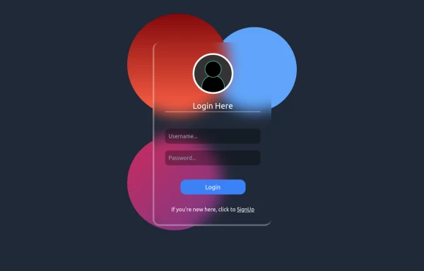
 Made a sinup form
Made a sinnup form
1 month ago183 -
 cards
cardscards with background animation
2 years ago11.4k -
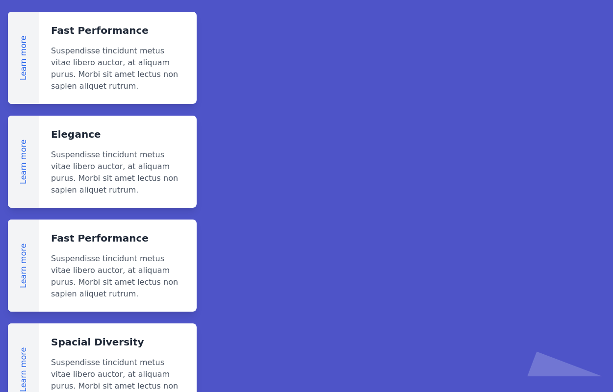
 products, show, items
display images, card, products
1 month ago192 -
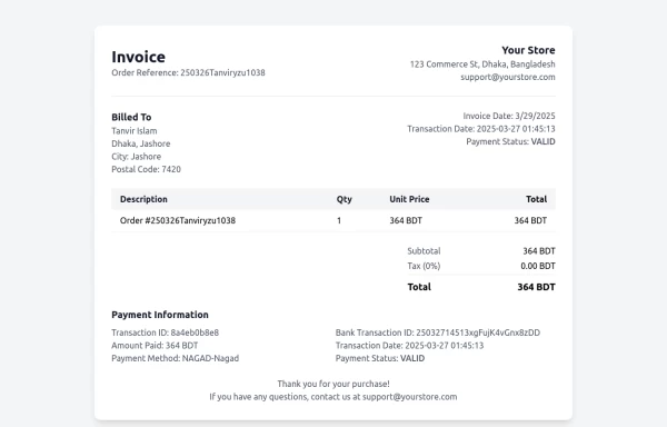 Invoice
Invoice
11 months ago823 -
 YouTube Community Post UI Mockup
A static HTML and Tailwind CSS component mimicking the user interface of a YouTube Community Post. This mockup features the channel header (avatar, name, verified badge, timestamp), post content (text and optional media), engagement actions (Like, Dislike, Comment, Share with counts), and the 'Add a comment' section. It's designed to be responsive, supports YouTube's light and dark themes via custom styling, and uses accurate iconography.
10 months ago972 -
 color blur
blur
1 year ago1.8k -
 machine
A fully interactive, web-based macOS-style desktop environment featuring draggable and resizable windows, a dynamic Dock with magnification, smooth glass UI effects, adaptive colors, a functional photo gallery with hover menus, and integrated mini-apps like Safari, Notes, Weather, and App Store. Built using HTML, CSS, Tailwind, and JavaScript to recreate a modern OS experience directly in the browser.
3 months ago235


Explore components by Tags
Didn't find component you were looking for?
Search from 3000+ components