- Home
-
card
card
card
This tailwind example is contributed by 5upreme505, on 21-Oct-2024. Component is made with Tailwind CSS v3. It is responsive.
Author 5upreme505
Related Examples
-
Services
Card Services Section. find it makecomponents.com
1 year ago2.2k -
GitHub For you Feed
GitHub For you Feed Clone
1 year ago2.4k -
Créer une story
Créer une story
2 months ago323 -
3 years ago15.1k
-
Profile Card with Transparent
Dynamic Background: Darker gradient background for better contrast Floating colored blobs for visual interest Profile Image Glow: Added a gradient glow effect behind the profile picture Smoother hover transition Typography Improvements: Larger, bolder name text Subtle hover underline animation for the name Better spacing and hierarchy
8 months ago1k -
Image Card
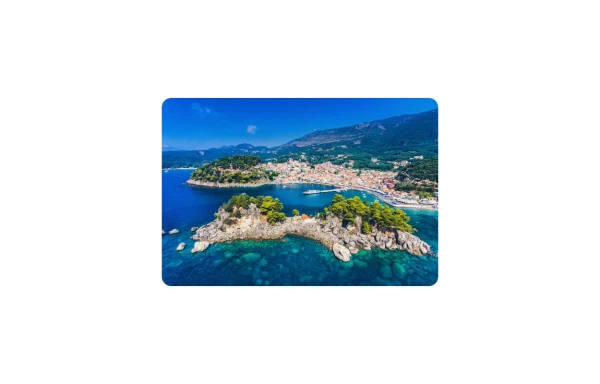
An image. Shows title and description info when hovering. Image zooms and darkens when hovering.
10 months ago829 -
Animated Pizza Menu Grid
A beautiful, interactive pizza product grid featuring smooth 360-degree rotation animations on hover. This free open-source component includes automatic dark mode support, responsive design (mobile, tablet, desktop), and an elegant "Add to Cart" button reveal effect. Built with HTML and Tailwind CSS - no dependencies required. Ideal for restaurant websites, food delivery platforms, e-commerce stores, or any product showcase needing eye-catching interactivity.
3 months ago584 -
Card KPI
Targetas
3 months ago428 -
3 years ago11.5k
-
1 year ago1.8k
-
1 year ago1.3k
-
10 months ago1k
Explore components by Tags
Didn't find component you were looking for?
Search from 3000+ components
