Colored checkboxes
use custom accent color according to your design
This tailwind example is contributed by Pixel Perfect, on 17-Feb-2024. Component is made with Tailwind CSS v3. It is responsive. It supports dark mode.

Author Pixel Perfect
Related Examples
-
 Radio Buttons
Users can click anywhere on the input field to select the radio option
3 years ago17k -
 5 months ago167
 -
Google like input field
with Floating Label. The input placeholder floats towards the upside as the input field is in focus.
3 years ago18k -
![Material 3 Checkboxes [Light]](https://tailwindflex.com/storage/thumbnails/material-3-checkboxes-light/canvas.min.webp?v=10) Material 3 Checkboxes [Light]
Material 3 Checkboxes [Light]Checkboxes that conform to Google's Material 3 design guidelines
9 months ago483 -
 tailwind contact form
tailwind contact form
1 year ago3.5k -
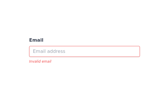 Invalid input detected message
incorrect input notification
2 years ago12.6k -
 3 years ago11.6k
 -
 3 years ago15.1k
 -
 2 years ago4.3k
 -
 1 year ago3.2k
 -
 tailwind contact form
tailwind contact form
1 year ago2.4k -
 3 years ago14.4k


Explore components by Tags
Didn't find component you were looking for?
Search from 3000+ components