Spinner rings
open ring spinners
This tailwind example is contributed by Samuel Dawson, on 03-Jan-2023. Component is made with Tailwind CSS v3. similar terms for this example are loading, loader

Author Samuel Dawson
Related Examples
-
Tailwind spinner
loading spinner component
3 years ago39.5k -
3 years ago17.3k
-
 3 years ago28k
 -
 3 years ago8.6k
 -
 3 months ago422
 -
3 years ago10.8k
-
 tailwind loading animation
Spinner component provides a dynamic loader indicator with animated
1 year ago1.8k -
3 years ago11.5k
-
 1 year ago2.2k
 -
 1 year ago1.3k
 -
 Spinner
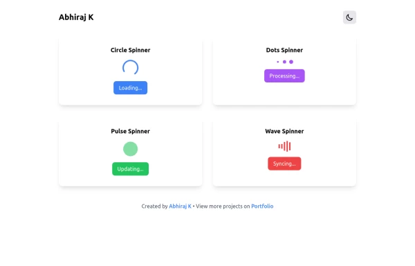
The Spinner is a simple and visually appealing component that indicates ongoing processes like loading or data fetching. It's a great way to improve user engagement and reduce frustration during wait times. Different styles and animations (circular, dots, pulsating). Customizable size, color, and speed. Easy to integrate with loading states in any app. Lightweight and responsive.
1 year ago2.2k -
 1 year ago1.3k


Explore components by Tags
Didn't find component you were looking for?
Search from 3000+ components