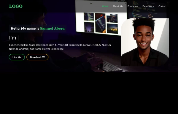
Portfolio Hero Section 5
This tailwind example is contributed by $@(\/)(\/)¥, on 31-Mar-2025. Component is made with Tailwind CSS v3. It is responsive. It supports dark mode. similar terms for this example are Front page,CV template

Author $@(\/)(\/)¥
Related Examples
-
 3 years ago22.2k
 -
 2 years ago7.2k
 -
 Hero w/ navbar
the modern and clean hero section
2 years ago5.5k -
 Hero Section
Home hero section search bar
2 years ago7.8k -
 Flour mill website landing page template
flour mill and services template website which comprise of many sections like about us, featured products, why us, visit us
1 year ago15.1k -
 About Us
This The About Us Component with the tailwind class and some animation by tailwind and best about us page you can modify it and content is for now only clinic but you can ad your content
1 year ago5k -
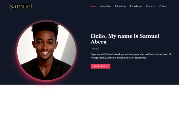 Portfolio Hero Section 1
visually stunning and captivating hero section component for your portfolio website.
1 year ago5.7k -
 Portfolio Hero Section 2
visually stunning and captivating hero section component for your portfolio website.
1 year ago5.6k -
 Portfolio Hero Section 3
visually stunning and captivating hero section component for your portfolio website.
1 year ago8.9k -
 1 year ago5k
 -
 beautifull web page
I create a web page using cloude ai its amazing.
1 year ago3.2k -
 beautifull portfolio page
I create a portfolio page
1 year ago2.1k


Explore components by Tags
Didn't find component you were looking for?
Search from 3000+ components