Navbar with Dropdown
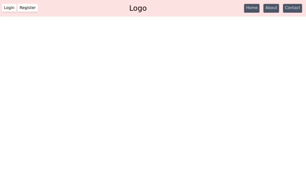
Navbar with dropdown
This tailwind example is contributed by Razeem Razak, on 16-Oct-2025. Component is made with Tailwind v3.4. It is responsive.

Related Examples
-
 Responsive Gradient Navbar with Toggle
A modern, responsive navbar built with Tailwind CSS. Features a gradient background, flex layout, smooth hover effects, and a mobile toggle menu for optimal usability on all screen sizes.
1.7k -
 15.1k
-

-
 Life Tree
by salvator
1.3k -
 New Nav Component
A new navigation component
3.8k -

-
 Admin Panel
Premium Admin Panel Pack including sidebar navigation, top navbar, dashboard. Fully responsive with modern clean design using Tailwind CSS.
1.5k -
 Modern Retail Analytics Dashboard UI with Interactive Charts
Dashboard built with HTML, Tailwind CSS, and vanilla JavaScript.
345 -
 Navbar
This navbar implementation includes: 1. Responsive design that works on both desktop and mobile 2. Indigo-800 and Blue-900 color scheme for the background and accents 3. Dark mode support with a toggle button 4. Beautiful animations and effects: 1. Fade-in animation for menu items with staggered delays 2. Hover effects on menu items with underline animation 3. Smooth color transitions 4. Mobile menu slide-down animation 5. SVG icons for the dark mode toggle and mobile menu button 6. "Sign Up" call-to-action button 7. Mobile-friendly dropdown menu 8. Accessibility considerations (proper heading structure, color contrast, focus styles) Key features: - The background uses a gradient from Indigo-800 to Blue-900 - The navbar has a white background in light mode and dark gray in dark mode - Text colors are adjusted for readability in both light and dark modes - Menu items have hover effects with color changes and underline animations - The dark mode toggle changes its icon based on the current mode - The mobile menu slides down with a smooth animation when toggled - Desktop menu items fade in with a staggered delay for a smooth entrance - Dark mode is automatically applied based on system preferences - The layout is responsive, with a hamburger menu for mobile screens This implementation provides a visually appealing and functional navbar with various animations and effects, using HTML, Tailwind CSS, and vanilla JavaScript for the interactions.
5.3k -
 Responsive NavBar Using CSS Only
A complete responsive navbar only using tailwind css
1.2k -
 Hover Animated Navbar
Remove the bg-black in the outer div when using it. Hovering the button and each item in the navbar has a fun animation.
4k -
 FinTech Banking Navbar with Trust Bar & Mobile Sidebar
A clean, enterprise-grade banking navigation bar built with pure HTML and Tailwind CSS. It features a trust announcement bar, responsive navigation, loan dropdown, secure call-to-action buttons, and a mobile sidebar. Perfect for fintech platforms, digital banks, insurance providers, investment firms, lending platforms, and financial service websites.
373







Browse by topic
Explore components by Tags
Jump straight to the UI pattern you need.
Can't find it?
Didn't find the component you were looking for?
Search across 3,000+ community-built components and grab the code in seconds.