section footer
This tailwind example is contributed by Raul antonio de la cruz hernandez, on 27-Nov-2025. Component is made with Tailwind CSS v3. It is responsive.

Related Examples
-
 3 years ago12k
 -
 3 years ago12.2k
 -
 Game changer
by salvator
9 months ago1.1k -
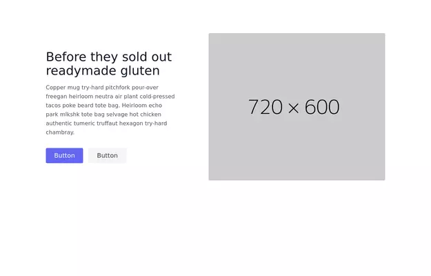
 Minimalistic Hero Section with Radial Gradient for E-Commerce
This hero section features a modern radial gradient background where the center remains white and fades into a soft blue at the edges. Designed for an e-commerce website, it provides a clean, elegant, and visually appealing layout with a bold headline, a call-to-action button, and a seamless user experience. The responsive design ensures a great appearance on all screen sizes.
1 year ago1.7k -
 home
homehtml , css
10 months ago1.9k -
 Hero simple
hero design simple
10 months ago1.4k -
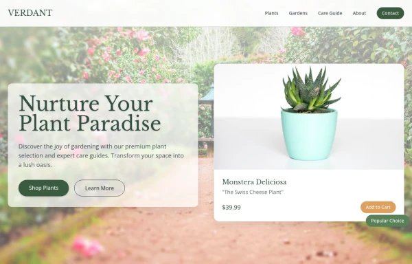 Garden
by salvator
9 months ago1.2k -
 3 years ago12.4k
 -
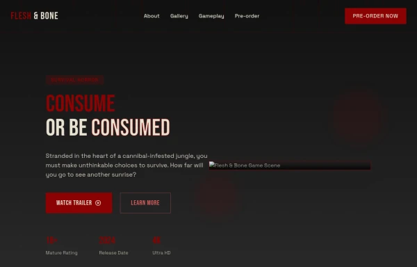
 Hero Section
Created a good and responsive web Hero Page
1 year ago2.7k -
 Magic Sound
by salvator
9 months ago1.1k -
 8 months ago1.4k
 -
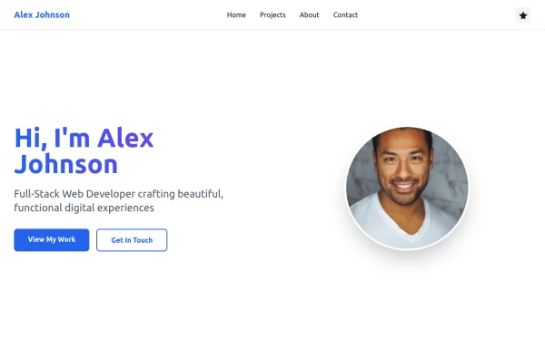 Simple web portfolio
The portfolio includes all required sections (Hero, Projects, About, Contact) with professional styling, and I've added some premium touches like social media icons, a sticky navigation, and beautiful gradient effects that make it feel cutting-edge and engaging.
9 months ago1.2k


Explore components by Tags
Didn't find component you were looking for?
Search from 3000+ components