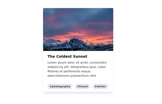
card
simple card for begin
This tailwind example is contributed by Omer fils ELENGA, on 22-Feb-2025. Component is made with Tailwind CSS v3. It is responsive.

Author Omer fils ELENGA
Related Examples
-
 3 years ago11.1k
 -
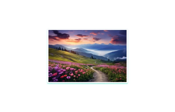 zoom in effect card
A responsive card featuring an eye-catching scenic image, designed with Tailwind CSS. This component includes hover effects for the image.
1 year ago2.4k -
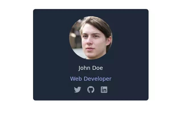 Profile card
Profile card with social icons
3 years ago13.3k -
 Pricing card
Reveal details on hover
1 year ago4.5k -
 2 years ago3.5k
 -
 8 months ago1k
 -
 3 years ago13.4k
 -
 1 year ago2.2k
 -
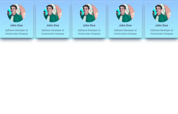
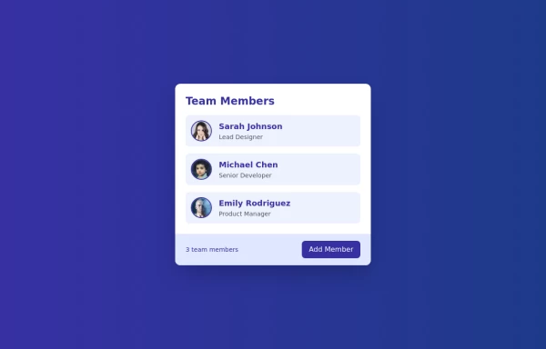 Cards - Users Card
This Users Card design includes: 1. Responsive layout using Flexbox 2. Indigo-800 and Blue-900 color scheme 3. Dark mode support 4. User list with avatars, names, and roles 5. Hover effects on user items 6. "Add Member" button 7. Card footer with team member count 8. Subtle animations and transitions 9. Accessibility considerations (proper heading structure, color contrast) Key features: - The background uses a gradient from Indigo-800 to Blue-900 - The card has a white background in light mode and dark gray in dark mode - Text colors are adjusted for readability in both light and dark modes - User avatars have a border color that changes in dark mode - User items have a hover effect that scales them slightly - The "Add Member" button uses Indigo-800 with a Blue-900 hover state - Dark mode is automatically applied based on system preferences - The entire card fades in on load for a smooth entrance - The card has a hover effect that enhances its shadow This design provides a clean, professional look for displaying team members while incorporating the requested color scheme and maintaining good usability across different devices and color modes.
1 year ago2.4k -
 11 months ago1k
 -
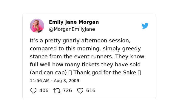 Twitter tweet clone
Replica of twitter tweet card
3 years ago10.1k -
 3 years ago24.4k


Explore components by Tags
Didn't find component you were looking for?
Search from 3000+ components