Feature Overview Section with Dark Mode Support
Feature cards with icon
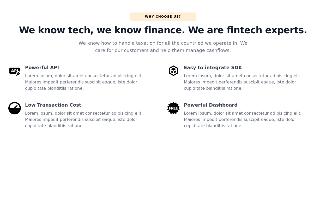
This tailwind example is contributed by Nomusa Botha, on 10-Dec-2024. Component is made with Tailwind CSS v3. It is responsive. It supports dark mode. similar terms for this example are Services,Why choose us

Author Nomusa Botha
Related Examples
-
-
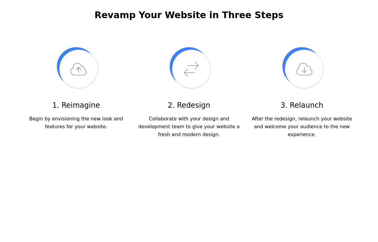 Steps section
Show features or steps of your website. Each step Includes Icons.
2 years ago9.6k -
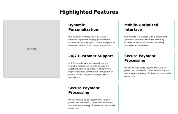
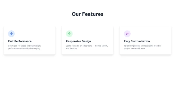 Features
A clean, responsive feature section with icons, smooth hover effects, soft backgrounds, and clear titles for modern website designs.
7 months ago516 -
 1 year ago1.4k
 -
 3 years ago15.5k
 -
 2 years ago17.1k
 -
 Employee Data Management System TailwindCSS,Html
This project is made of only html and even tailwind is using CDN to save storage space. Best for SPA and routing with other components .
1 year ago1.5k -
 1 year ago3k
 -
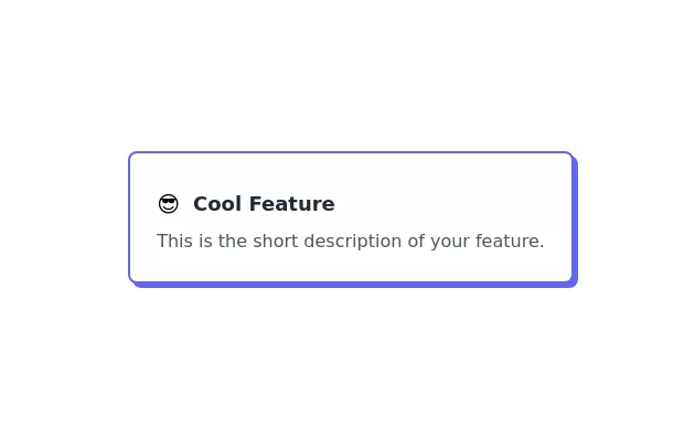 Feature Card
Elevated card
3 years ago10.6k -
 3 years ago11.3k
 -
 Meet the Team Section with Team Member Cards
Meet the Team Section with Team Member Cards
1 year ago4.4k -
 SaaS Feature Section
It has a Gradient text headline and CTA buttons
2 years ago9.4k


Explore components by Tags
Didn't find component you were looking for?
Search from 3000+ components