layout deisgn img
img grid layout
This tailwind example is contributed by nahid hasan, on 15-Mar-2025. Component is made with Tailwind v3.4. It is responsive.

Related Examples
-
 600
600 -
 Blog post showcase minimal
a grid showcasing the blog posts with images and title
4.1k -
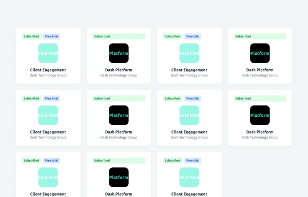 TailwindCss-flex/grid2
TailwindCss-flex/grid
743 -
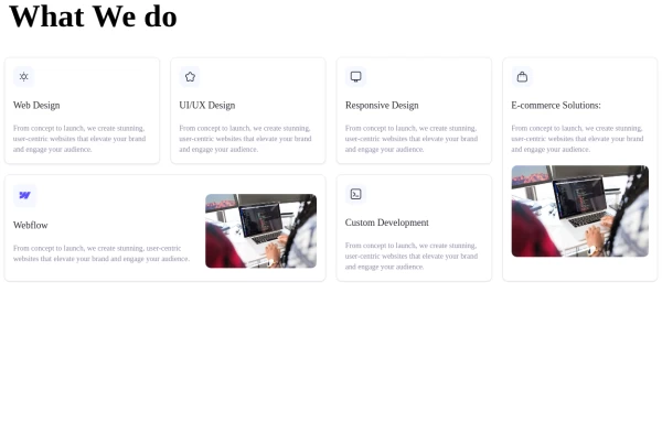
-
 Contact Form Component
A multi-step, responsive contact form with a modern dark-themed design. The form includes four steps: name, email, phone number, and message. It features a side panel with contact information and a sleek, gradient-styled interface using Tailwind CSS.
-

-
 Responsive Light Mode Footer Component
This is a fully responsive and reusable light-mode footer component designed by ABNahid Agency. Built with a clean structure and optimized for modern web applications, this footer features essential sections, including About, Services, Contact, and Social Links. Ideal for personal portfolios, business websites, or startup platforms—plug and play in your React or HTML project.
-

-

-
 Data Metrics Showcase
An information panel designed to instill trust, presenting vital statistics about a service or product. The grid layout offers a clean and organized look for displaying key data.
9k -
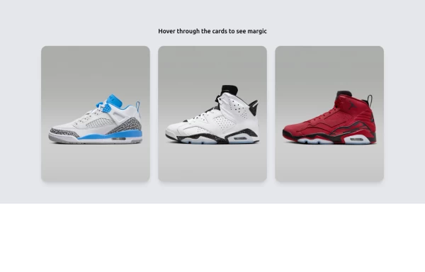 Amazing E-commerce card
An amazing e-commerce card with stunning hover effect
3.3k -
 products, show, items
display images, card, products






Browse by topic
Explore components by Tags
Jump straight to the UI pattern you need.
Can't find it?
Didn't find the component you were looking for?
Search across 3,000+ community-built components and grab the code in seconds.