Blog post showcase minimal
a grid showcasing the blog posts with images and title
This tailwind example is contributed by Henrik R., on 11-Apr-2024. Component is made with Tailwind CSS v3. It is responsive. It supports dark mode. similar terms for this example are Article Card, Blog page card, Article card

Author Henrik R.
Related Examples
-
 Tailwind image gallery
Responsive grid with evenly spaced image cards. Each card has a title label at the bottom, and there's a subtle hover effect for interactive engagement.
2 years ago60.6k -
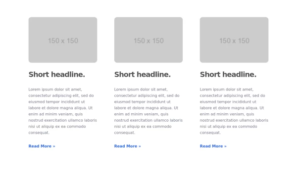
 Blog Post Showcase
a grid showcasing the blog posts with images and brief descriptions
1 year ago4.3k -
 3 years ago12.4k
 -
 3 years ago16.4k
 -
 3 years ago11k
 -
 2 years ago24k
 -
 Blog post cards
responsive blog post cards
2 years ago12.5k -
 2 years ago22.6k
 -
 Responsive card grid
responsive card grid for articles
2 years ago15.7k -
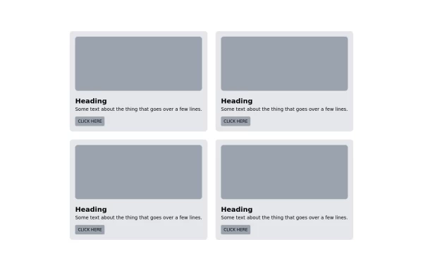
 Card grid section
Display article/blog grid
2 years ago29.1k -
 Responsive card grid
Responsive card grid for posts section
2 years ago11.1k -
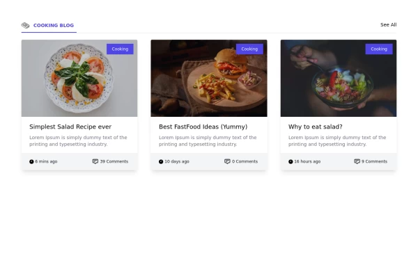
 News website like card grid
fancy card grid
2 years ago13.9k


Explore components by Tags
Didn't find component you were looking for?
Search from 3000+ components