MobileMenu
Mobile Menu + AlpineJs
This tailwind example is contributed by Maxim, on 09-Feb-2024. Component is made with Tailwind CSS v3. It is responsive.

Author Maxim
Related Examples
-
 Hamburger menu button with open/close animation
Open and close animation onclick requires alpineJs
3 years ago20.1k -
3 years ago17.9k
-
 Tab Menu
Tab menu
1 year ago6.6k -
 11 months ago1.8k
 -
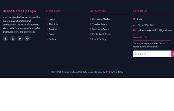 Footer
A footer is a critical part of any professional website. A footer ensures your website is complete, professional, user-friendly, and legally compliant. It's where users go for answers when they're done scrolling.
8 months ago1k -
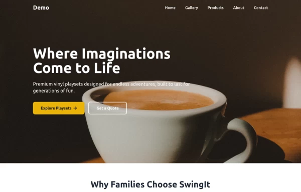
 Tailwind CSS Navbar
Logo on the left. Main menu with a mega menu under "Services". Responsive design with a hamburger menu for mobile devices. Mega menu appears on hover for desktop and toggles on click for mobile.
8 months ago1.1k -
 navbar
navbar
1 month ago80 -
 10 months ago1.6k
 -
 hero modern
hero modern
1 month ago127 -
 vscode a la omerlinks
vscode a la omerlinks
2 months ago142 -
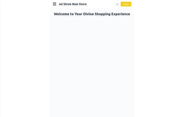 Responsive eCommerce Sidebar Layout with Hamburger Menu | Tailwind CSS UI for Online Stores
Build a clean and responsive eCommerce sidebar layout with a smooth hamburger menu using Tailwind CSS and Alpine.js. Ideal for devotional, spiritual, or modern online stores. Includes dark mode support, navigation links, cart, login, and a dynamic layout for beautiful product pages.
9 months ago1.1k -
![Material 3 Menu [Light]](https://tailwindflex.com/storage/thumbnails/material-3-menu-light/canvas.min.webp?v=6) Material 3 Menu [Light]
Material 3 Menu [Light]A menu that conforms to Google's Material 3 design guidelines
8 months ago451


Explore components by Tags
Didn't find component you were looking for?
Search from 3000+ components