Hero with button
This tailwind example is contributed by Laurits, on 01-Feb-2023. Component is made with Tailwind CSS v3. It is responsive. similar terms for this example is banner

Author Laurits
Related Examples
-
 3 years ago9.1k
 -
 3 years ago12.4k
 -
 beautifull web page
I create a web page using cloude ai its amazing.
1 year ago3.2k -
 3 years ago10.6k
 -
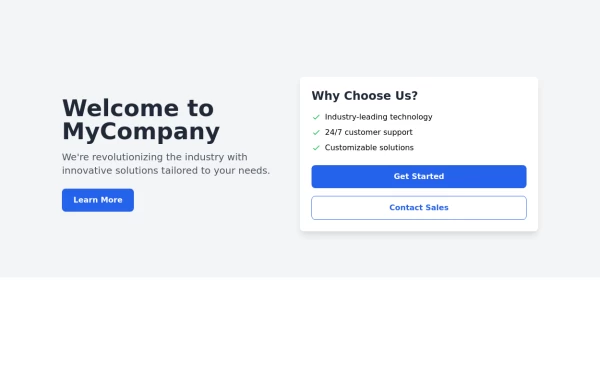 Responsive Hero Section
Key features of this hero section: 1. Responsive layout: Uses a column layout on mobile and switches to a row layout on medium screens and larger. 2. Left side: - Company name as a large heading - Brief description - "Learn More" button 3. Right side: - "Why Choose Us?" section with bullet points - Two call-to-action buttons: "Get Started" and "Contact Sales" 4. Styling: - Uses Tailwind's utility classes for responsive design, colors, spacing, and typography - Incorporates a shadow and rounded corners for the right-side content box - Includes hover effects on buttons for better interactivity This hero section will be fully responsive: - On mobile devices, it will stack vertically with the company info on top and the details below. - On larger screens, it will display in a two-column layout. The use of Tailwind CSS classes ensures that the design is consistent and easily adjustable. You can further customize the colors, fonts, and spacing to match your brand's specific design guidelines. Would you like me to explain any part of this code or make any adjustments?
1 year ago2.2k -
 Responsive Hero Section
Key features of this hero section: 1. Responsive layout: Uses a column layout on mobile and switches to a row layout on medium screens and larger. 2. Left side: - Company name as a large heading - Brief description - "Learn More" button 3. Right side: - "Why Choose Us?" section with bullet points - Two call-to-action buttons: "Get Started" and "Contact Sales" 4. Styling: - Uses Tailwind's utility classes for responsive design, colors, spacing, and typography - Incorporates a shadow and rounded corners for the right-side content box - Includes hover effects on buttons for better interactivity This hero section will be fully responsive: - On mobile devices, it will stack vertically with the company info on top and the details below. - On larger screens, it will display in a two-column layout. The use of Tailwind CSS classes ensures that the design is consistent and easily adjustable. You can further customize the colors, fonts, and spacing to match your brand's specific design guidelines. Would you like me to explain any part of this code or make any adjustments?
1 year ago2.8k -
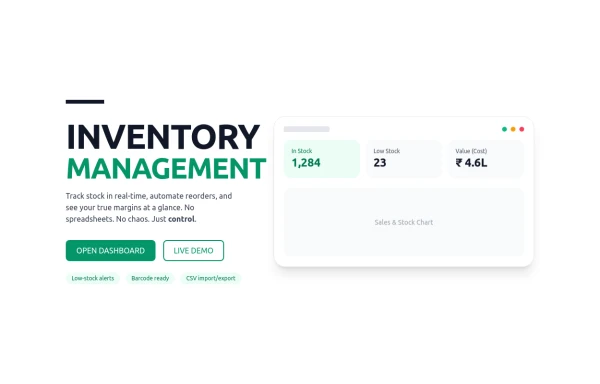 Inventory
management
4 months ago415 -
 card section neon
card section neon
1 month ago264 -
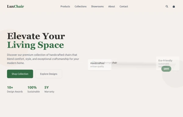 chair
chairby salvator
9 months ago1.1k -
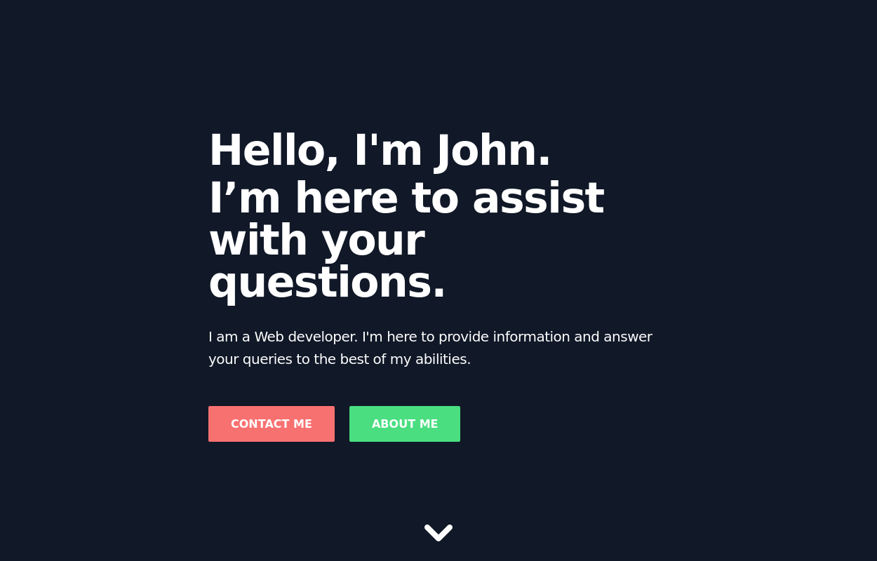 Full-page header for landing pages
an attention-grabbing header with a strong message and clear calls to action.
2 years ago11.9k -
 5 months ago412
 -
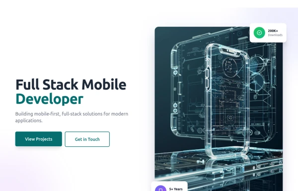
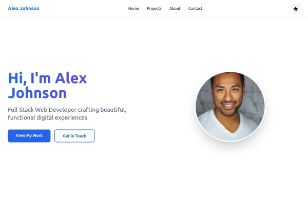 Simple web portfolio
The portfolio includes all required sections (Hero, Projects, About, Contact) with professional styling, and I've added some premium touches like social media icons, a sticky navigation, and beautiful gradient effects that make it feel cutting-edge and engaging.
9 months ago1.2k


Explore components by Tags
Didn't find component you were looking for?
Search from 3000+ components