Showcase Card
This tailwind example is contributed by Jaber Zarif, on 12-Jul-2024. Component is made with Tailwind CSS v3. It is responsive.

Author Jaber Zarif
Related Examples
-
 1 year ago1k
 -
 2 years ago3.5k
 -
 Deals of the Day - Exclusive Discounts!
Grab the best deals on top products with unbeatable discounts! Limited-time offers on premium gadgets, fashion, and more. Shop now and save big before the deal ends!
1 year ago977 -
 3 years ago10k
 -
 Hello Acode Master! 👋
is a passionate software developer based in Rubavu. He considers himself the top developer in the area and is committed to solving real-world problems through technology.
9 months ago872 -
 card
cardbest responsive tailwind card
9 months ago855 -
 Products card grid
Example of product card grid with product image and pricing
3 years ago24.1k -
 3 years ago31.7k
 -
 Instagram Post UI Mockup
A static HTML and Tailwind CSS component that visually replicates the user interface of an Instagram post. This mockup includes the post header (avatar, username, options), image area, action buttons (like, comment, share, save), like count, caption, and comment section. It features responsive constraints and supports both light and dark mode, closely mimicking the look and feel of the actual Instagram app. Ideal for UI prototyping, style guides, or frontend development practice.
10 months ago1.4k -
 Basic US Flag Card
Here's a set of card components styled with Tailwind CSS that represent various US-themed elements:
9 months ago641 -
 1 year ago2.8k
 -
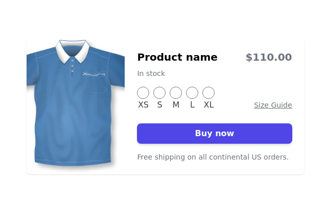
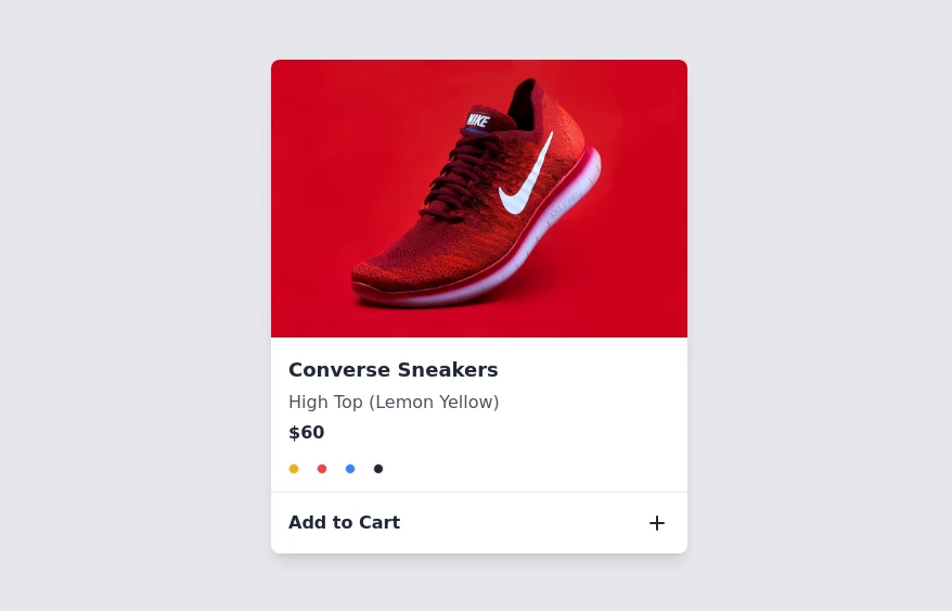 Product card
sleek and modern product card
1 year ago6.6k


Explore components by Tags
Didn't find component you were looking for?
Search from 3000+ components