- Home
-
Responsive Tailwind CSS Navbar
Responsive Tailwind CSS Navbar
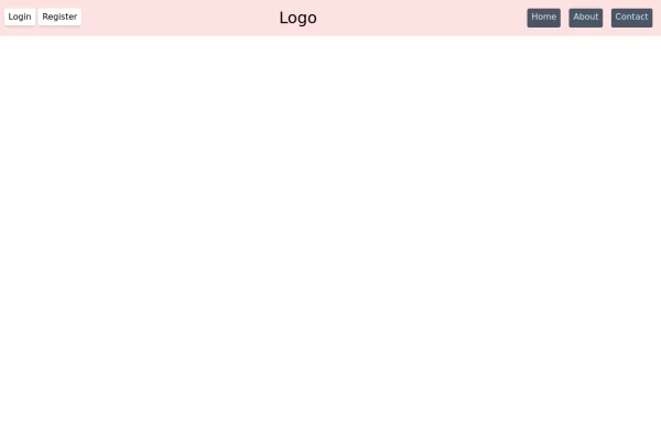
A clean and professional navigation bar built with Tailwind CSS. This component includes a logo, navigation links, and a mobile menu with a toggle button for smaller screens. Fully responsive and easy to integrate into any project. Ideal for portfolios, business websites, or modern web apps.
This tailwind example is contributed by irahoza daniel, on 20-May-2025. Component is made with Tailwind CSS v3. It is responsive. It supports dark mode.
Author irahoza daniel
Related Examples
-
Minimalistic navbar
Responsive navbar
3 years ago21.1k -
3 years ago16.7k
-
New Nav Component
A new navigation component
1 year ago3.5k -
Navbar
E-commerce Navbar
1 year ago4.8k -
Tailwind css navigation header
Tailwind css navigation header
1 year ago2.6k -
Animated underline hover navbar
Simple animated underline hover effect navbar.
1 year ago2.9k -
Hover Animated Navbar
Remove the bg-black in the outer div when using it. Hovering the button and each item in the navbar has a fun animation.
1 year ago3.5k -
1 year ago2.6k
-
1 year ago2.6k
-
1 year ago2k
-
Responsive Navbar with TailwindCSS
responsive navbar built with TailwindCSS, perfect for mobile and desktop views
1 year ago1.7k -
Nav Bar
Animated Mobile Dropdown menu
1 year ago2.2k
Explore components by Tags
Didn't find component you were looking for?
Search from 3000+ components


