Swiss-Grid Dark Pricing
A brutally minimalist pricing section that relies on strict grid architecture and typographic hierarchy instead of decorative elements. Features responsive border collapsing, monospaced technical accents, and high-performance CSS-only hover states. Designed for high-end SaaS, dev-tools, or agency portfolios that prioritize data clarity and structural rhythm.
This tailwind example is contributed by Hamza Atig, on 27-Dec-2025. Component is made with Tailwind CSS v3. It is responsive. It supports dark mode. similar terms for this example are Service rates, Subscription plans

Author Hamza Atig
Related Examples
-
 Table CRUD
CRUD TABLE DESIGN
1 year ago3.7k -
 masonary grids effect for cards using columns
As part of the redesign I was trying to think of ways to lay out testimonials from students, which may have varying length/content, I stumbled onto the idea of using a masonry layout (think bricks, think Pinterest).
1 year ago1.3k -
 11 months ago1.3k
 -
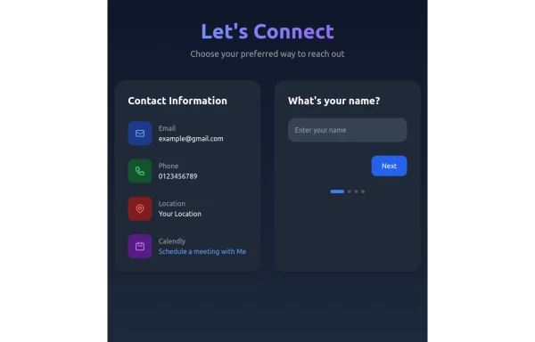 Contact Form Component
A multi-step, responsive contact form with a modern dark-themed design. The form includes four steps: name, email, phone number, and message. It features a side panel with contact information and a sleek, gradient-styled interface using Tailwind CSS.
11 months ago1.3k -
 Responsive Hero Section with Typewriter Effect
A modern hero section featuring a typewriter animation effect, social media links, and responsive design. Includes a user avatar placeholder and a clean dark gradient background. Built with Tailwind CSS and Font Awesome icons. Perfect for personal portfolio websites.
11 months ago691 -
 Tailwind CSS Service Card Component
An HTML and Tailwind CSS code snippet for creating a responsive service card component. Ideal for marketplaces, portfolios, or listing pages. Includes sections for image/video preview, seller info, rating, pricing, and additional details. Easy to customize using Tailwind utility classes.
11 months ago1.2k -
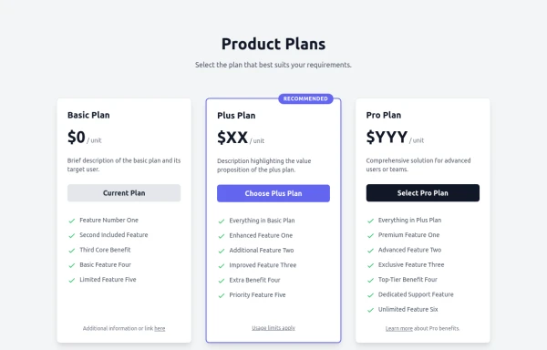 Responsive Multi-Tier Pricing Table Component
flexible and responsive 3-tier pricing table component built with HTML and Tailwind CSS. Features distinct visual styles for different plans (e.g., highlighting a recommended option), adapts to various screen sizes, and supports both light and dark color schemes. Uses generic placeholders for easy adaptation to any product or service.
11 months ago1.6k -
 Instagram Post UI Mockup
A static HTML and Tailwind CSS component that visually replicates the user interface of an Instagram post. This mockup includes the post header (avatar, username, options), image area, action buttons (like, comment, share, save), like count, caption, and comment section. It features responsive constraints and supports both light and dark mode, closely mimicking the look and feel of the actual Instagram app. Ideal for UI prototyping, style guides, or frontend development practice.
11 months ago1.5k -
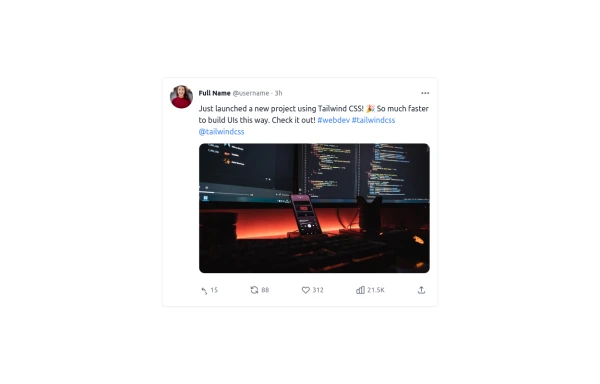 Twitter Post (Tweet) UI Mockup
A detailed static HTML and Tailwind CSS component replicating the user interface of a single Twitter post (Tweet). This mockup includes the user avatar, tweet header (name, handle, timestamp), tweet text with styled hashtags/mentions, optional media display, and the action bar with icons and counts (Reply, Retweet, Like, Views, Share). It is responsive, supports light and dark modes, and uses accurate iconography and hover states to closely resemble the real Twitter UI.
11 months ago784 -
 YouTube Community Post UI Mockup
A static HTML and Tailwind CSS component mimicking the user interface of a YouTube Community Post. This mockup features the channel header (avatar, name, verified badge, timestamp), post content (text and optional media), engagement actions (Like, Dislike, Comment, Share with counts), and the 'Add a comment' section. It's designed to be responsive, supports YouTube's light and dark themes via custom styling, and uses accurate iconography.
11 months ago1.2k -
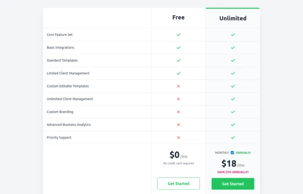 Comparison Pricing Table Component
A responsive pricing table built with HTML and Tailwind CSS, comparing two plans (Free and Unlimited) with a clear feature checklist. Includes distinct styling for the premium plan and a toggle for monthly/annual pricing display.
11 months ago1.5k -
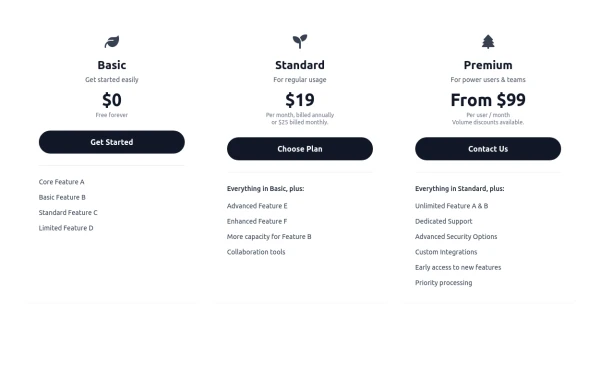 Responsive 3-Tier Pricing Card Section
A clean and responsive pricing table component featuring three distinct tiers (e.g., Basic, Standard, Premium) presented in a card layout. Built with HTML and Tailwind CSS, it stacks vertically on small screens and transitions to a side-by-side view on medium screens (md breakpoint - 768px) and up. Each plan card includes a placeholder icon, title, description, price details, a call-to-action button, and a bulleted list of features with checkmarks. The generic content makes it easy to adapt for various websites or applications needing a clear pricing comparison structure.
11 months ago710


Explore components by Tags
Didn't find component you were looking for?
Search from 3000+ components