Responsive Contact Section Using Tailwind CSS
This HTML and Tailwind CSS snippet creates a visually appealing and responsive contact section. Designed to adapt seamlessly across different screen sizes, this component features two main areas: the contact information block and a contact form. The contact block displays essential details like phone, email, and address, alongside social media links, all encapsulated within a cyan-themed card with rounded corners and shadow effects for depth. The form area, highlighted with a contrasting white background, ensures a user-friendly interface for submitting contact details. This code snippet is perfect for integration into any modern web application requiring a responsive and stylish contact section.
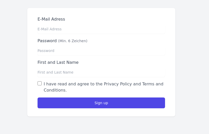
This tailwind example is contributed by Fathallah Anass, on 27-Jun-2024. Component is made with Tailwind CSS v3. It is responsive. similar terms for this example are Register, Sign in

Author Fathallah Anass
Related Examples
-
 3 years ago18.2k
 -
 Login page with tailwind (SB admin 2)
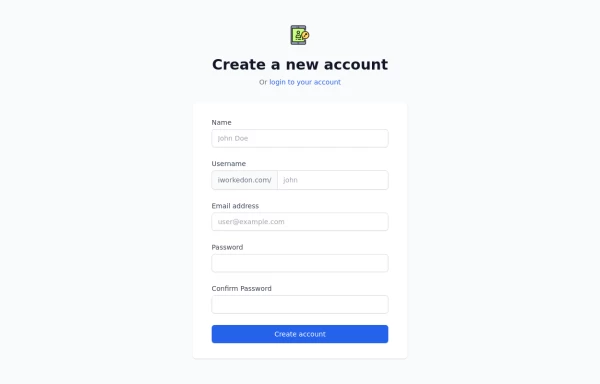
This component features a split-screen design with a background image on one side and a registration form on the other.
3 years ago24.1k -
 3 years ago11.6k
 -
 3 years ago14k
 -
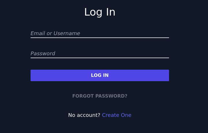
 Simple Login Form
Very basic responsive login form. The form is centered within a white card with a shadow, featuring input fields for username and password. The design is clean and user-friendly.
3 years ago50.1k -
 3 years ago13k
 -
 3 years ago12.4k
 -
 3 years ago15.2k
 -
 3 years ago25.2k
 -
 3 years ago24.7k
 -
 3 years ago13.4k
 -
 3 years ago11.5k


Explore components by Tags
Didn't find component you were looking for?
Search from 3000+ components