card appetizer
ss
This tailwind example is contributed by Anonymous, on 30-Oct-2024. Component is made with Tailwind v3.4. It is responsive.

Related Examples
-

-
 3D Interactive Premium Card
This sleek, modern UI card elevates the standard design with a three-dimensional, interactive experience. Utilizing a subtle 3D parallax tilt that responds to your mouse movement and a smooth, sweeping light-refraction effect on hover, the card instantly communicates premium quality and technical sophistication. It's built for presenting key metrics and deployment actions with dynamic flair.
1.2k -
 1.5k
1.5k -
 card
cardcard simple hover
-
 card
cardcard section. find it makecomponents.com
2.5k -
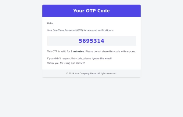 Otp-code template
This is an OTP code template that contains the one-time password, which can be sent to the user's email either when they are signing up for the first time or for multi-factor authentication (MFA) during the login process.
4k -
-
 13.6k
13.6k -
 Ripple Animation
Component is made with Tailwind CSS v3. It is responsive. It supports dark mode. similar terms for this example are loading, loader,Author box, User information,Transitions
794 -
-
 ApexCodeStudios.com Social Media Post Card
Get Access to 216+ Free Premium Tailwind CSS UI Components at apexcodestudios.com. This component excels with its clean typography using Inter font, smooth hover effects, responsive design, and seamless light/dark mode switching.
-
 Elegant Cards
Useful Tailwind classes for creating several types of cards. Ranging from simple text to more complex cards with animations and video.
1.1k


Browse by topic
Explore components by Tags
Jump straight to the UI pattern you need.
Can't find it?
Didn't find the component you were looking for?
Search across 3,000+ community-built components and grab the code in seconds.